
The Styler in the Kata theme is a powerful tool designed to help you customize the appearance of your website without needing to write custom CSS. It offers an intuitive interface for making visual changes to the layout, typography, colors, and various other design elements of your site. Here’s a complete explanation of how the Styler works and its key features:
Key Features of Styler in the Kata Theme
1. Live Customization:
The Styler provides a live preview of the changes you make, which allows you to see the effects of your modifications in real time. This helps you understand how each change affects your website’s appearance before publishing it.
2. Global Settings:
The Styler allows you to adjust global settings that affect the entire site, such as typography, colors, and layout. These settings ensure consistency across all pages and sections.
3. Typography Settings:
You can customize the font settings for headings, body text, menus, and other elements. The Styler provides options to select different fonts, adjust font sizes, line heights, and letter spacing. It also allows you to modify font weight and style, helping you create a unique look for your website.
4. Color Customization:
The Styler gives you the ability to change the color scheme of your website. You can modify primary, secondary, background, and text colors. The color picker tool allows for precise control over the colors, and you can also set color transparency for certain elements.
5. Layout Settings:
The Styler enables you to adjust layout options such as the container width, spacing between elements, and the alignment of content. You can tweak the layout of the header, footer, sidebars, and content areas, making it easier to create a custom layout without any coding.
6. Button and Link Styling:
The Styler provides options to modify the appearance of buttons and links. You can adjust button shapes, sizes, hover effects, and text colors. Similarly, you can customize the colors, underlining style, and hover effects of links throughout the site.
7. Spacing and Margins:
One of the important features of the Styler is the ability to adjust the spacing and margins between elements. You can increase or decrease the space between sections, rows, and columns to create the desired visual hierarchy and improve content readability.
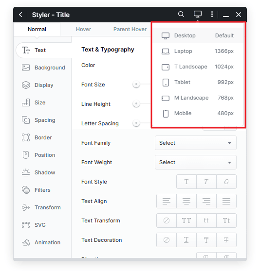
8. Responsive Design Options:
The Styler offers responsive controls, which means you can customize how your site looks on mobile devices, tablets, and desktops. You can adjust font sizes, padding, and margins specifically for each device type, ensuring that the site looks great across all screen sizes.
9. Advanced Customization:
For those with more experience, the Styler allows you to adjust more specific details of the website design, such as animations, hover effects, and advanced typography. These options are perfect for creating a unique and dynamic user experience.
How to Use the Styler in Kata Theme
1. Accessing the Styler:
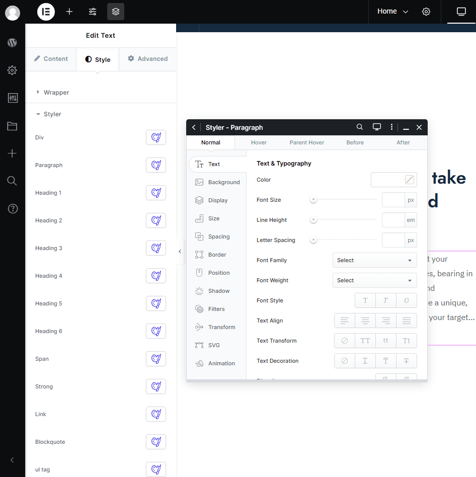
To access the Styler, edit your page in Elementor and add one of Kata’s elements. Once added, you will see various elements in the Style tab, each with a Styler icon next to the options. You can open the Styler by clicking on the icon corresponding to the specific option.
2. Making Changes:
Once you’re in the Styler section, you can begin adjusting various settings. Changes are typically divided into different tabs, such as Typography, Colors, Layout, and more.
As you make adjustments, you’ll see live previews of your changes. This allows you to experiment with different styles until you find the right combination for your site.
3. Saving Changes:
After making the desired changes, click Publish or Save to apply them to your live site. If you’re not satisfied with the changes, you can always return to the Styler and tweak the settings further.
4. Responsive Settings:
Make sure to check how your site looks on different devices by switching to the mobile or tablet view in the Styler. This allows you to adjust font sizes, margins, and other elements specifically for those devices.
The Styler consists of four sections:
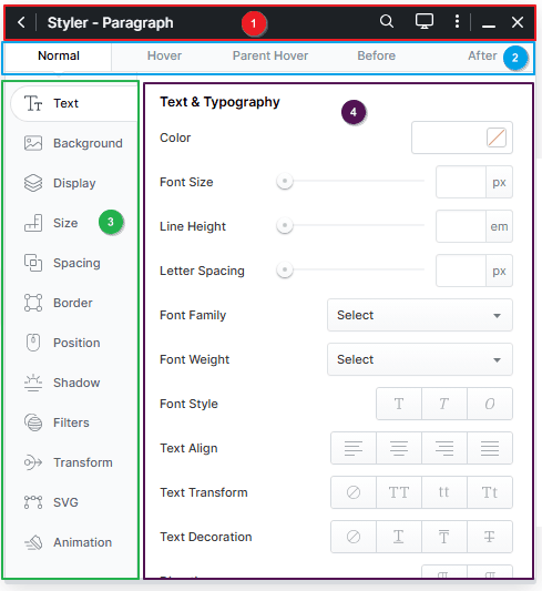
1) The Style Header includes:
a. The Collapse Menu button.
b. The element name and selector.
c. The Zoom button.
d. The Devices button.
e. The More button.
f. The minimize button.
g. The Save and Close button.
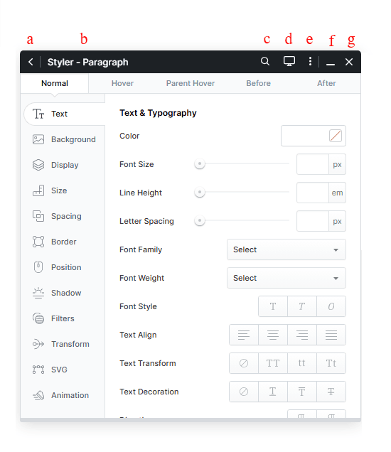
The responsive menu displays different sizes for various devices in responsive design.
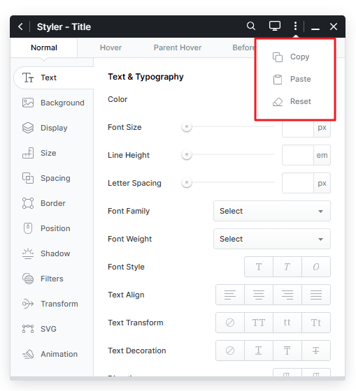
In the More menu, you’ll find options to copy, paste, and reset styles in the Styler.
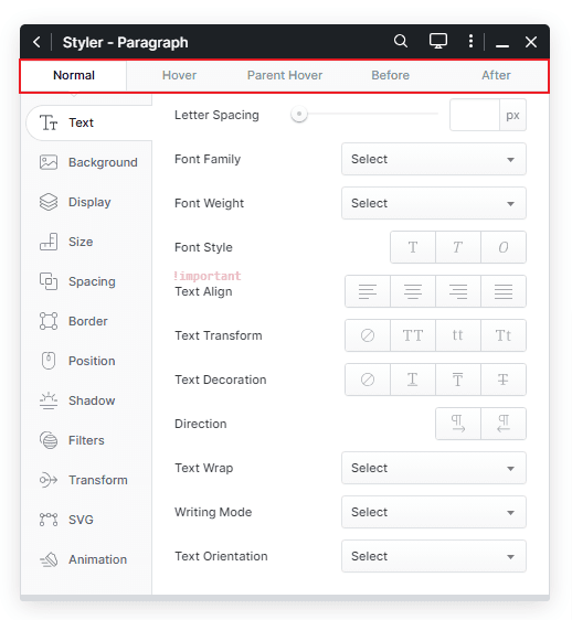
2) Selector Tab: There are multiple tabs to customize the selector.
a. Normal: Applies styles directly to the selector.
b. Hover: The styles entered here will appear in a hover state.
c. Parent Hover: Styles entered here will have their wrapper loaded when hovered.
d. Before: This allows you to style the selector before this element.
e. After: This allows you to style the selector after this element.
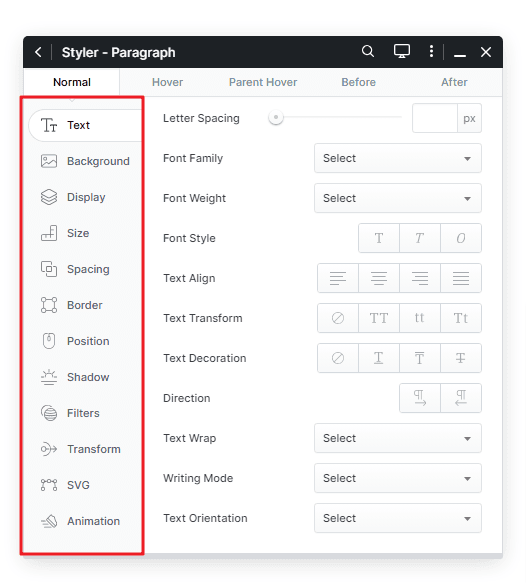
3) CSS Properties: Related properties are grouped on the left side of the Styler for easy access. You can view and customize the properties for each option on the right side.
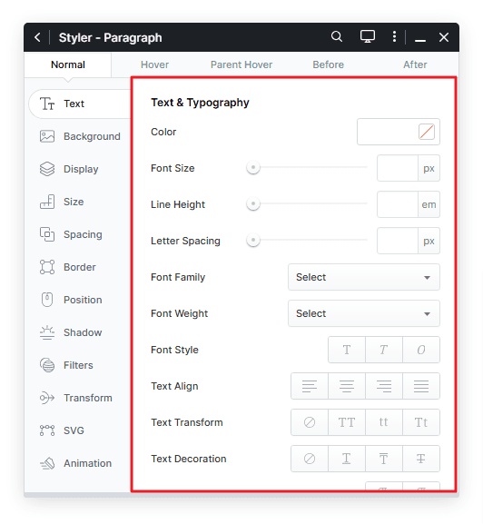
4) Here you can see a list of CSS properties whose values you can easily change. All changes will be applied to the elements in real time.
Benefits of Using the Styler in Kata Theme
- User-Friendly: The Styler offers an intuitive interface that makes it easy for users to customize their websites without needing coding knowledge.
- Time-Saving: It allows for quick design changes and real-time previews, saving you time compared to manually editing CSS files.
- Consistency: By using global settings for colors, typography, and layout, the Styler ensures consistency across your entire website.
- Mobile Optimization: With responsive design options, you can ensure that your website looks great on all screen sizes, improving the user experience.
Conclusion
The Styler in the Kata theme is an essential tool for customizing your website’s design and layout. It provides an easy-to-use interface for making visual adjustments without writing code, while still offering flexibility for more advanced customizations. Whether you are looking to change typography, adjust colors, or create a custom layout, the Styler has everything you need to create a beautiful, functional website.
