The Theme Options or Customizer can be accessed in two ways: through WordPress’s default menu by navigating to Kata > Options, or by going to Appearance > Customize.
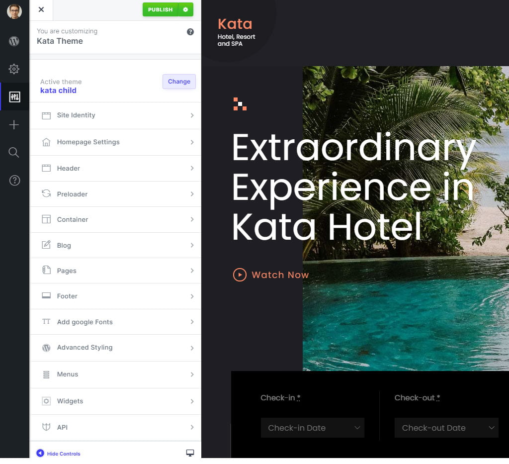
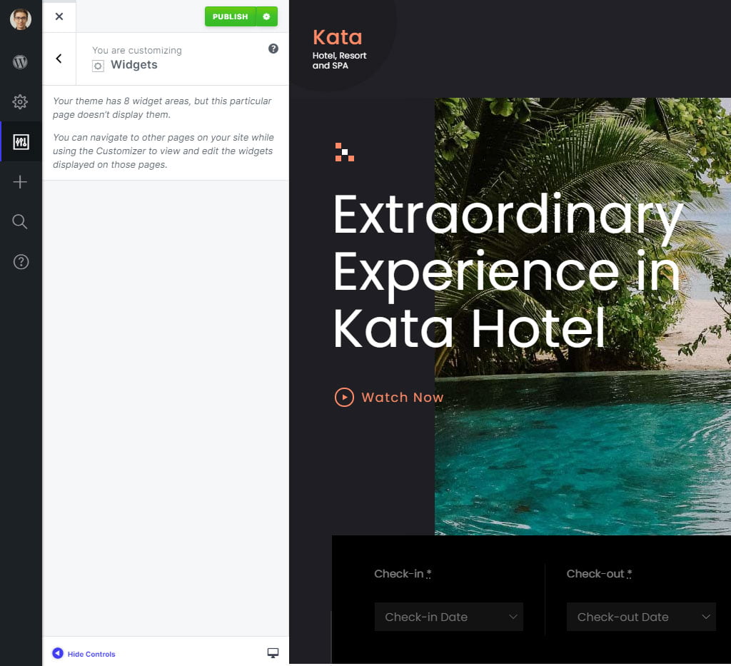
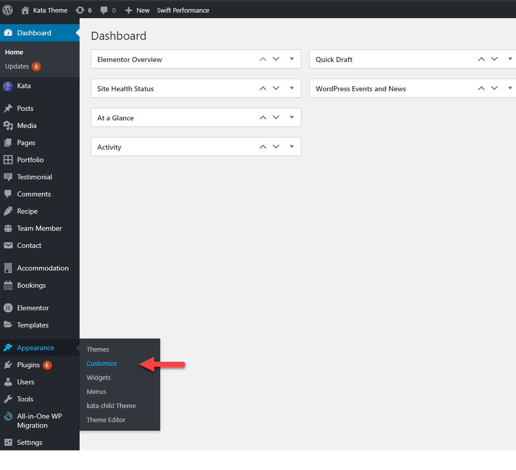 The image below provides an overview of the Customizer page, featuring options on the left side and a preview section on the right. It closely resembles the default Customizer in WordPress.
You can modify your website’s general settings on this page, and see the changes in real-time on the right side of the screen.
Note: Once you’re done changing your settings, don’t forget to click on Publish to apply the changes. In case no changes have been made, this button will appear grayed out.
Additionally, you can modify your website’s theme using the available options, such as:
Site Identity
Layout: you can determine the layout of the website’s pages (Boxed or Wide) from here. If the option is set to Wide, the webpage’s container will fill the user’s whole screen, and if set to Boxed, the container’s width will be limited.
Responsive: If you need your website to be responsive, make sure to turn on the next option.
Scalable webpage: This option allows the user to scale the website.
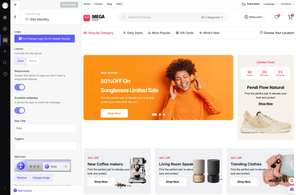
Site Title and Tagline: Here you can change your site title and tagline. As you may know, these two fields will be displayed in your visitor’s browser tab, and their function is to outline your website’s identity in a few short phrases.
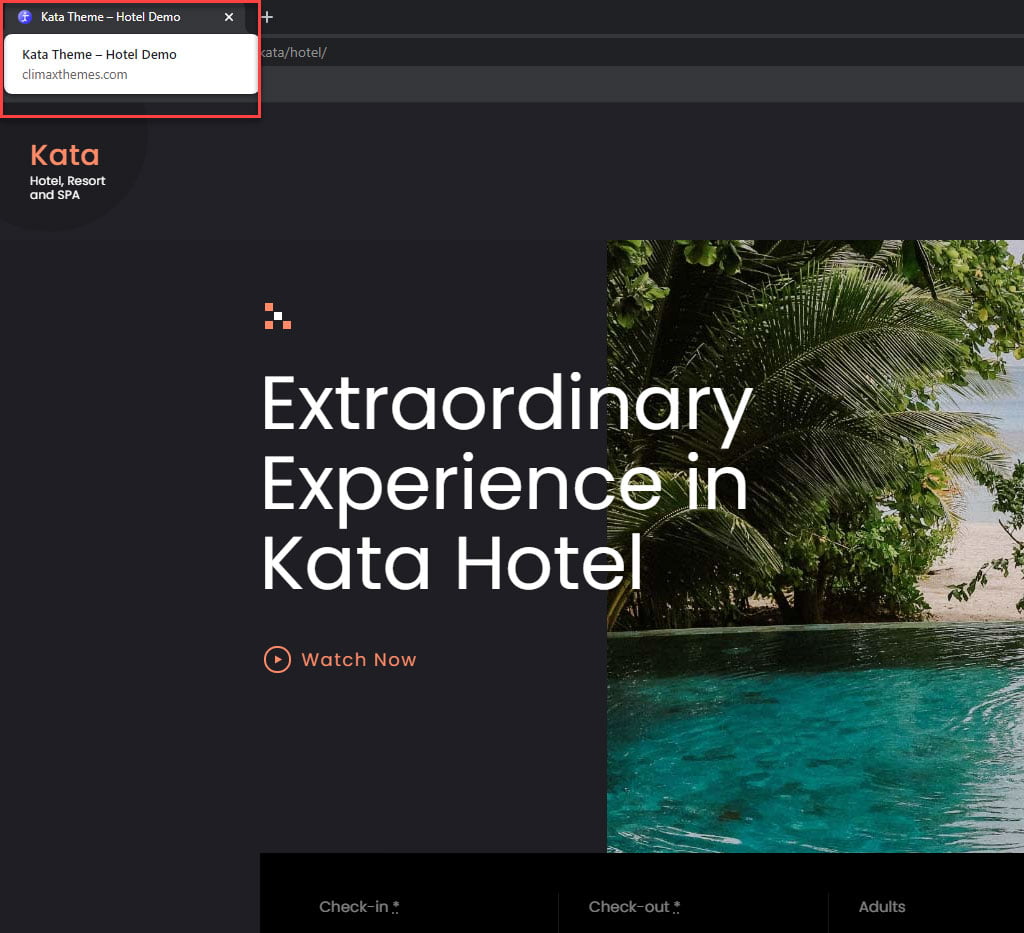
Site Icon: This option is related to your website’s icon. The icon can be seen in the browser tab, bookmark bar, and mobile apps. Upload your desired site icon.
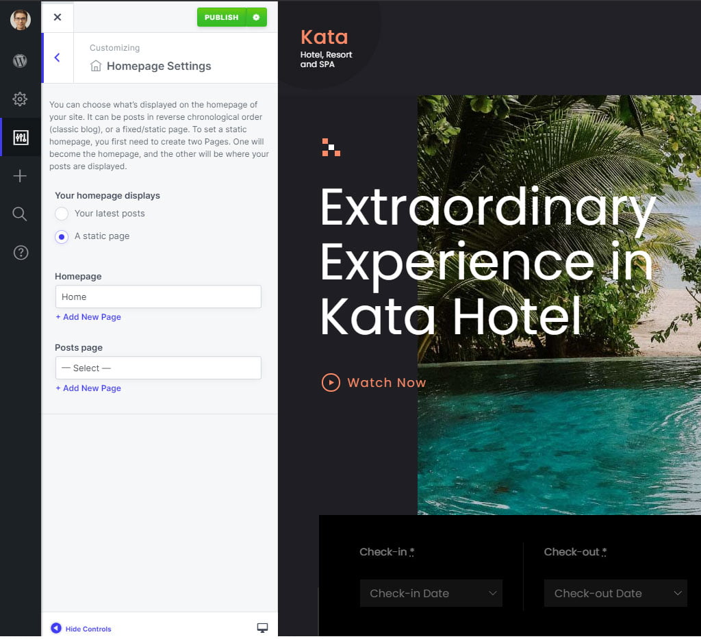
Homepage Setting
You can choose what’s displayed on the homepage of your site. It can be your posts in reverse chronological order (classic blog) or a fixed/static page. To set a static homepage, you first need to create two Pages. One will become the homepage, and the other will be where your posts are displayed.
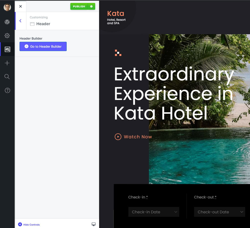
Header
In this section, you can access the header builder and begin editing it.
Advanced Styling
In this section of Customizer, you can modify the primary color and the most common color patterns of your theme using the Styler tool. Additionally, you can easily implement unique typography for your website. The available options in this section include:
- Body
- All Heading
- Heading 1
- Heading 2
- Heading 3
- Heading 4
- Heading 5
- Heading 6
- Paragraph (p tag)
- Blockquote
- Links (a tag)
- ul tag
- li tag
- ol tag
- Image (img tag)
- Button
- Table
- tr tag
- th tag
- td tag
- Input
- Textarea
- Select
- Checkbox
- Radio
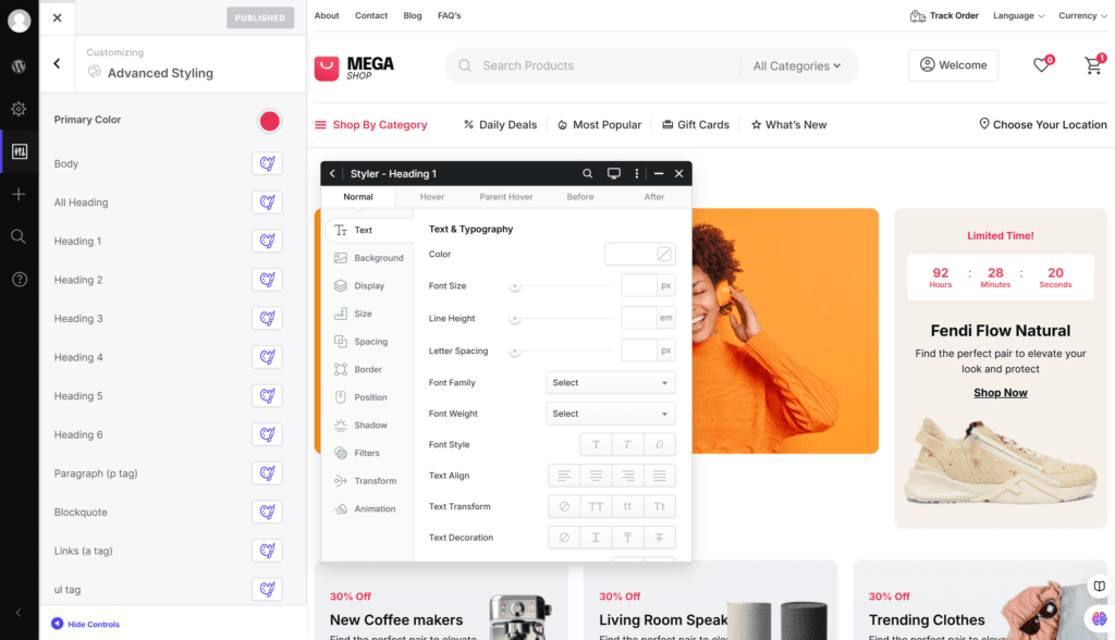
You can add any styles you wish to these HTML tags using the Styler, and your unique typography will be ready.
Container
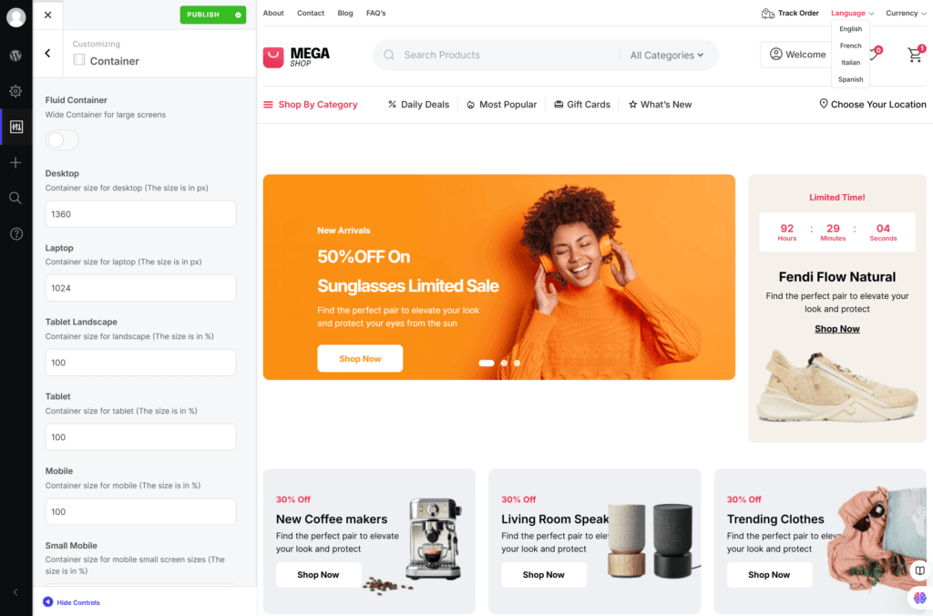
The container’s width in different screen sizes can be adjusted from here. Kata allows for 6 different screen sizes for different devices:
- Desktop (1920px)
- Laptop (1366px)
- Tablet Landscape (1024px)
- Tablet (768px)
- Mobile (480px)
- Small Mobile (320px)
You can set a custom width for the container on the desktop. However, for laptops and landscape tablet views, we recommend using 1024px and 100%, respectively. For tablet, mobile, and small mobile sizes, we suggest widths of 78%, 90%, and 88% in that order. These values are merely recommendations, and you are welcome to choose your own widths as needed.
Preloader
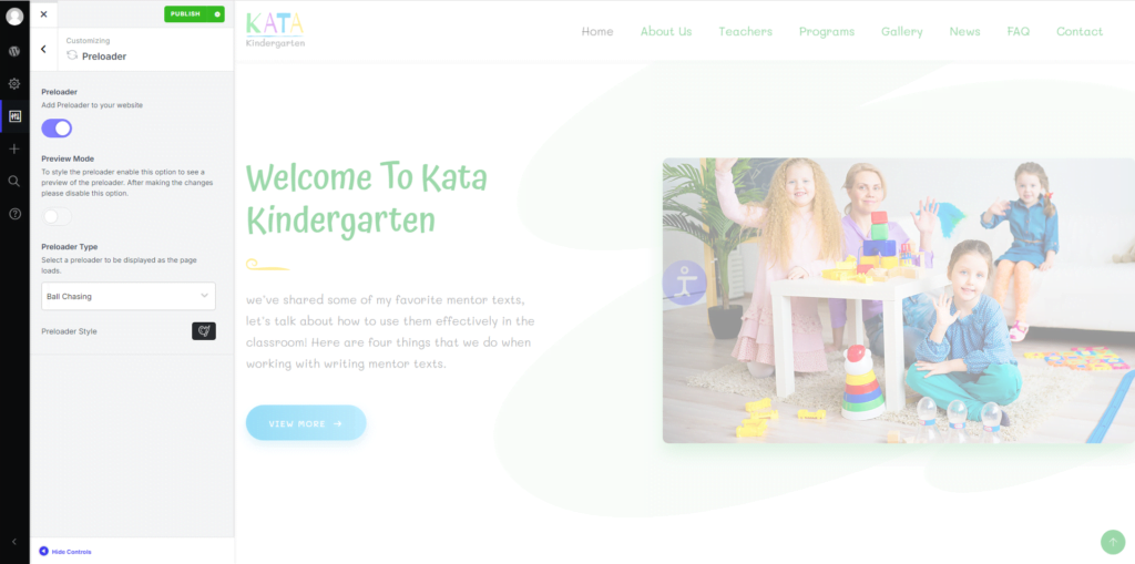
You can set up a great looking preloader until your page is fully loaded. After activating it, several options appear that allow you to customize it using the Styler.
Blog
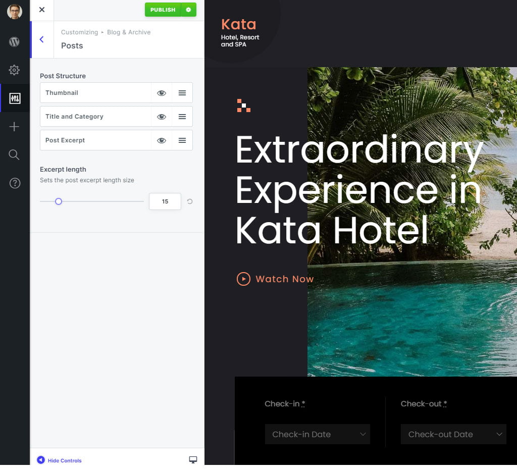
This section features three options: Blog, Archive Page, and Single Post. By selecting each of these options, you can customize each of these pages using Elementor.
Pages
You can adjust the general settings for WordPress pages here, including options for Breadcrumb, Page Title, Blog, Archive, Author, Search, 404 Not Found, and Sidebar.
You can customize the page by showing or hiding specific sections based on your preferences. Additionally, you can enhance the visual appeal of the page using the Styler tool, along with various other features that allow you to adjust layout, colors, fonts, and more.

Breadcrumbs: This section allows you to show or hide page breadcrumbs.

Page Title: This section allows you to show or hide page Page Title.

Blog: This section allows you to show or hide the header on the blog page, adjust the header’s transparency, show or hide the blog title, and customize its appearance using the styler options.

Archive: This section allows you to show or hide the header on the Archive page, adjust the header’s transparency, show or hide the Archive title, and customize its appearance using the styler options.

Author: This section allows you to show or hide the header on the Author page, adjust the header’s transparency, show or hide the Author title, and customize its appearance using the styler options.
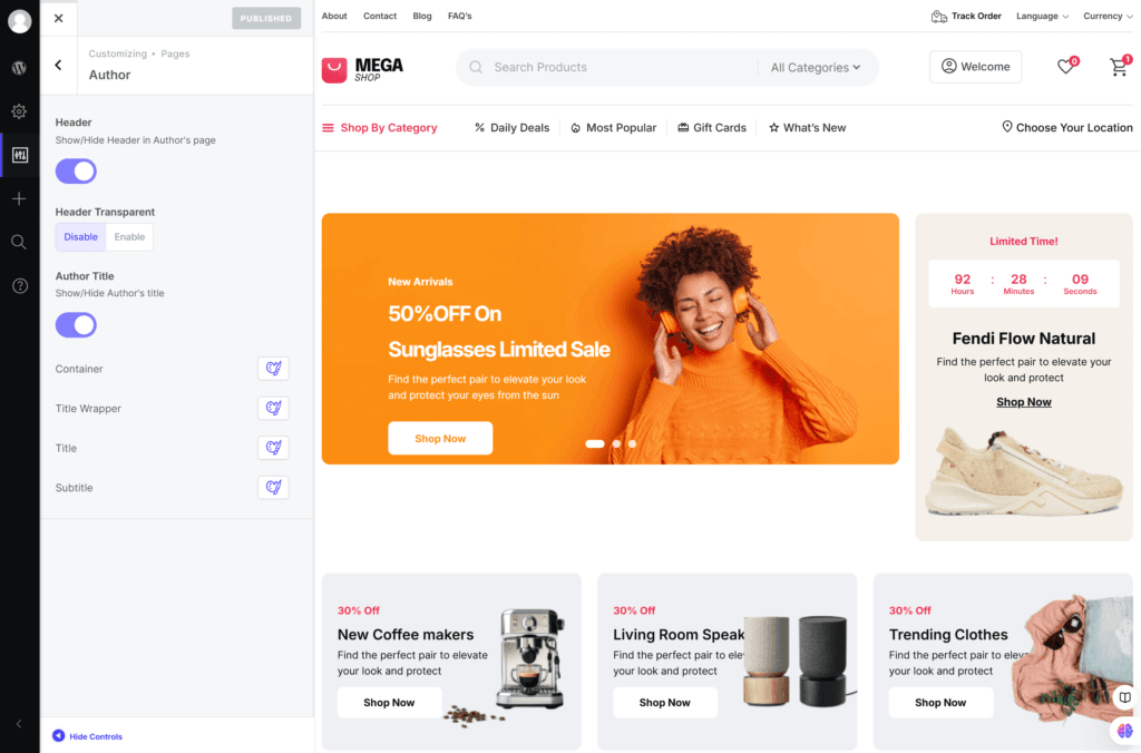
Search: This section allows you to show or hide the header on the Search page, adjust the header’s transparency, show or hide the Search title, and customize its appearance using the styler options.
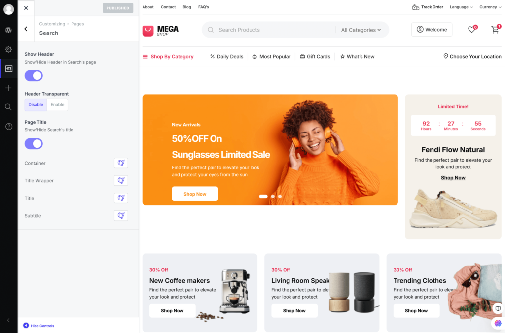
404 Not Found: This section allows you to show or hide the header on the 404 page and adjust its transparency.

Sidebar: This section allows you to configure the positions of the sidebar on pages.

Menu
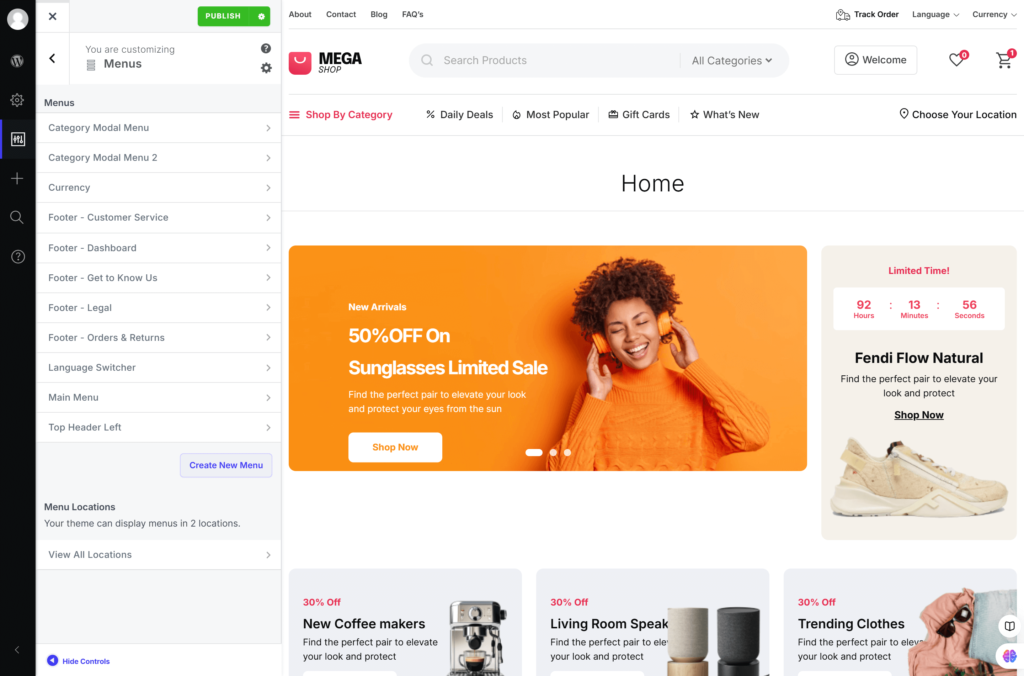
You can manage your website’s menu from here. All menus are listed in this section; you’re free to add items to the menu or change their order and add top-level pages automatically to the menus.

Footer
In this section of the customizer, you can go to the footer editor and edit.

Font Manager
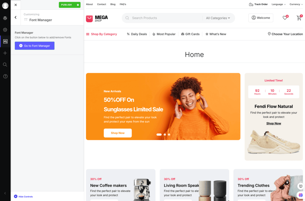
In this section, you can access the Font Manager Editor and add or remove fonts by clicking the button.
Widgets
This section allows you to manage and configure your website’s widgets.
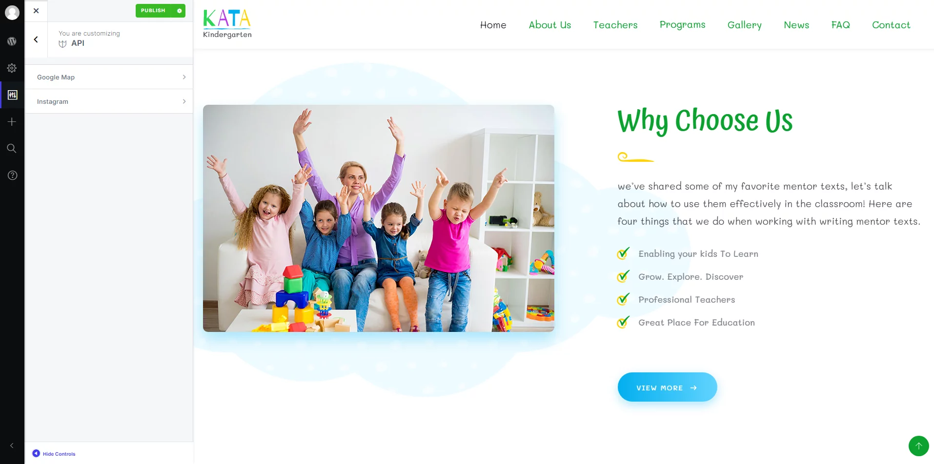
API
This section currently has two options, and those are Google Maps API and Instagram API. You can set Google Maps’s API Key and Instagram API from here.
Performance
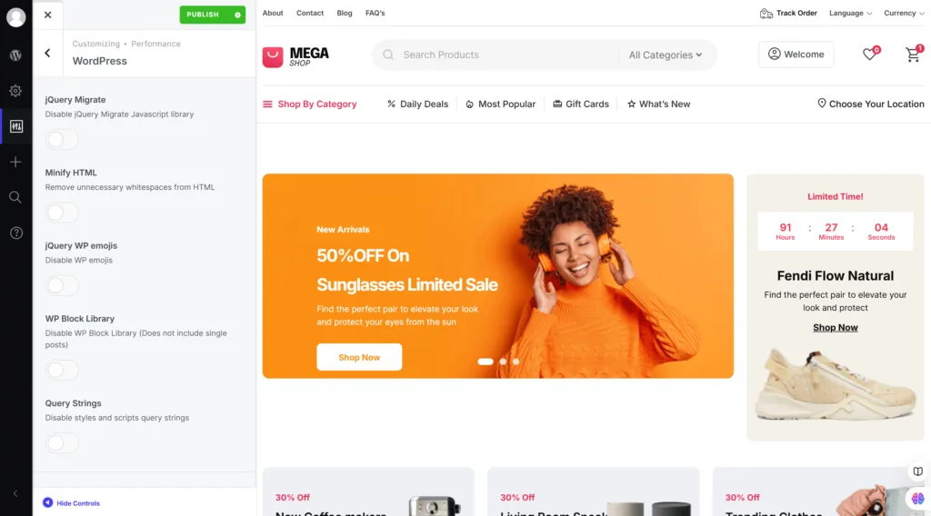
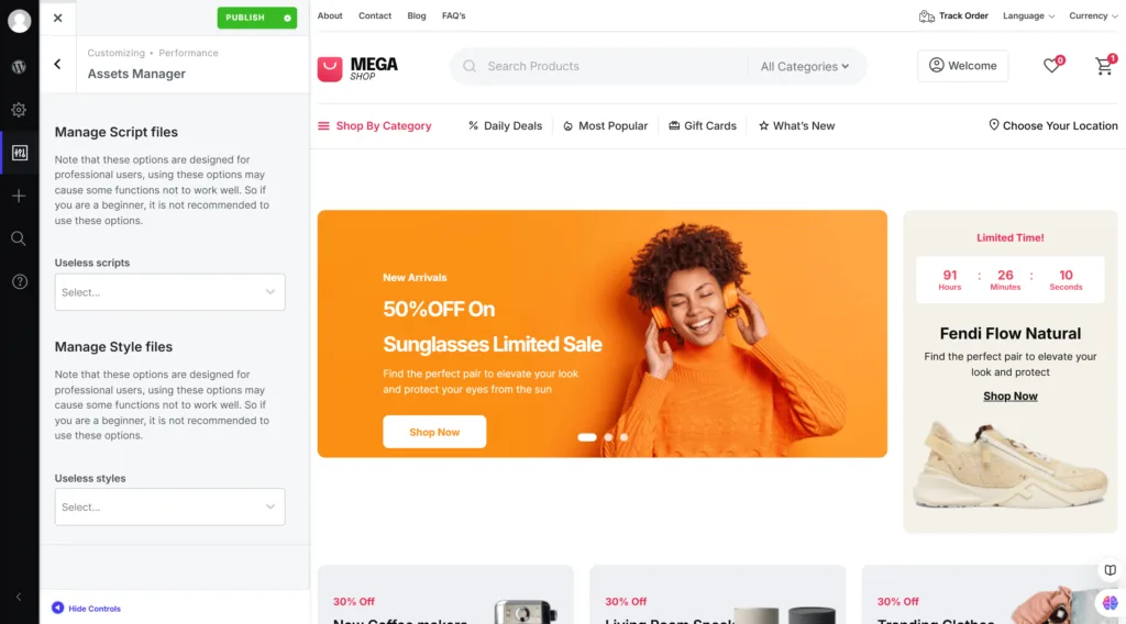
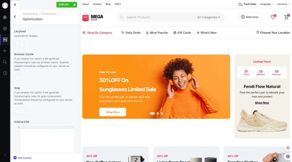
In this section, you’ll find four options to help you optimize your site: Elementor, WordPress, Assets Manager, and Optimization. Each of these options has some features designed to boost your site’s performance.
Elementor: Here, you’ll discover a variety of options, all explained in a friendly way right below each one, so you know exactly what each does.
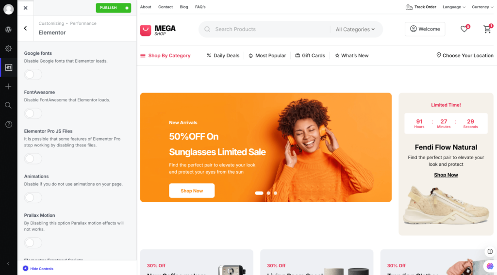
WordPress: This section is packed with helpful options as well. We’ve made sure to provide clear explanations for each function underneath, making it easy to navigate.
Assets Manager: Dive into this section to find several options designed to manage your site’s assets. You’ll find straightforward explanations right under each option.
Optimization: This section offers a range of options, each with a description below to help you understand their benefits.
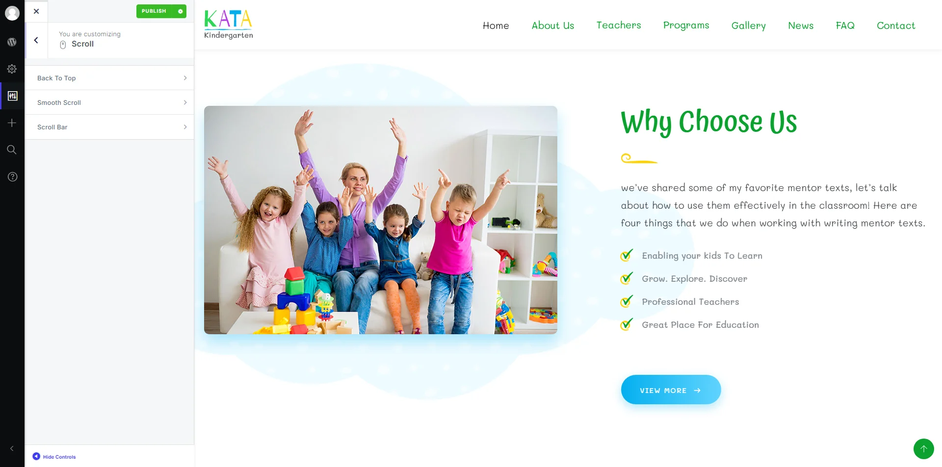
Scroll
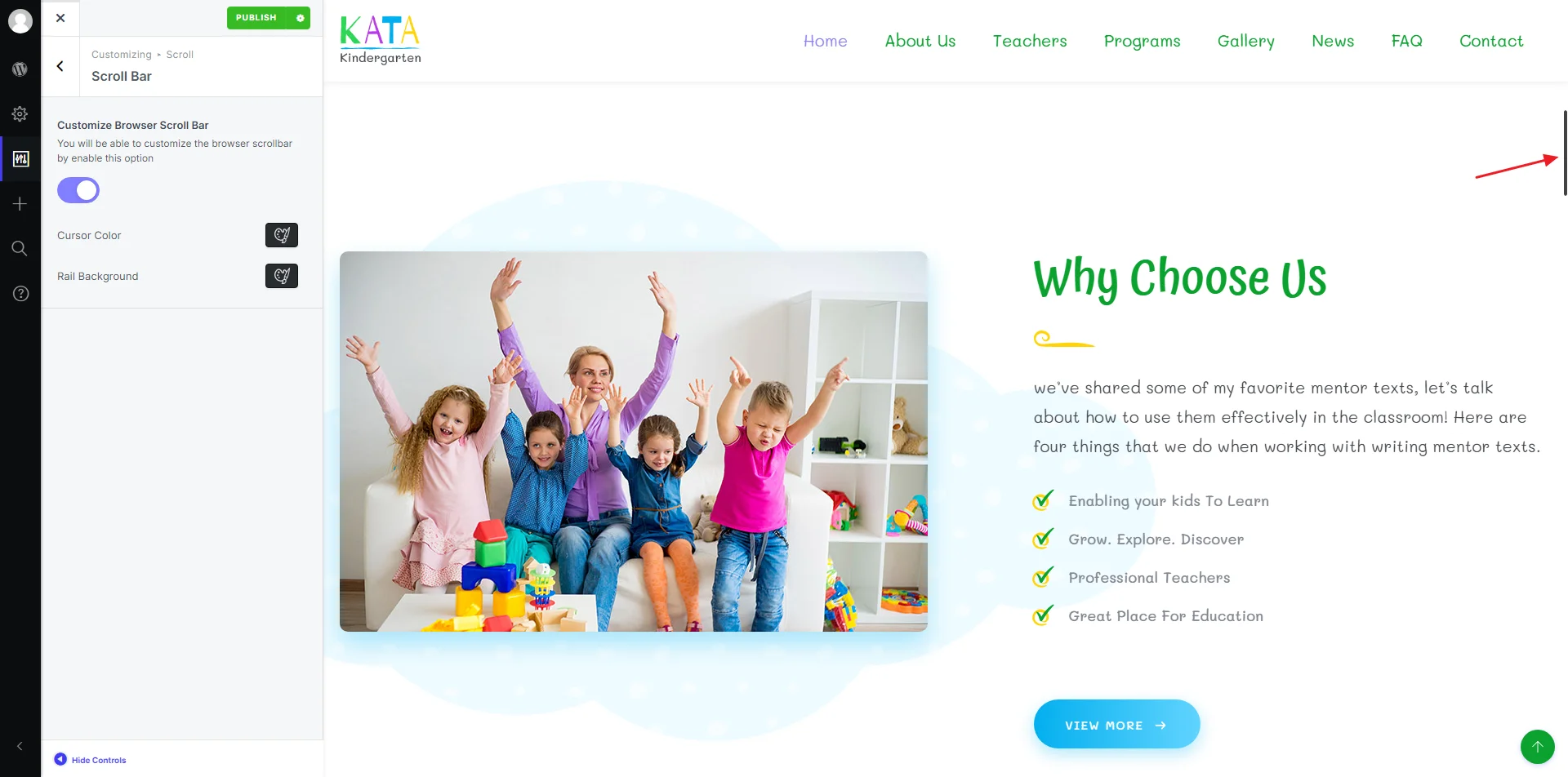
You can view the options related to Scroll from here.
Three options are available:
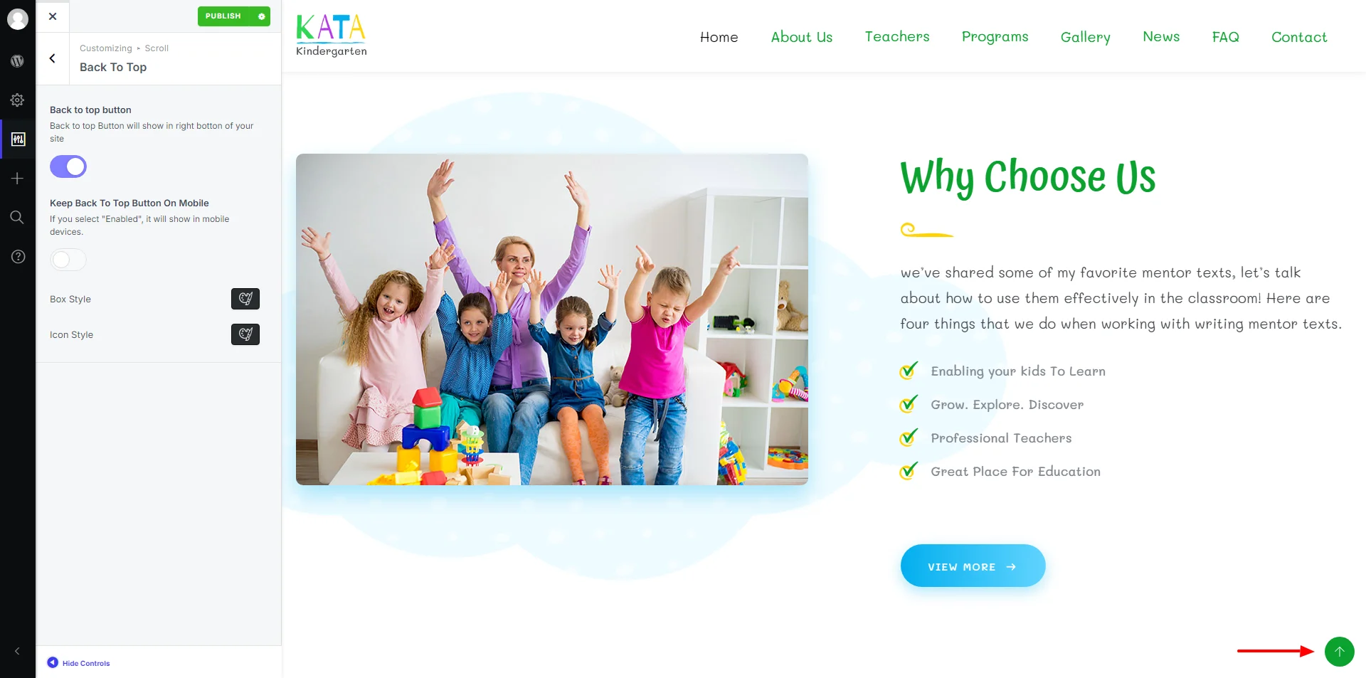
Back to Top: This can be disabled or enabled (also separately on mobile) and styling from the Styler.
Smooth Scroll: Enable or disable the feature for smooth scrolling on your page.
Scroll Bar: Enable or disable the feature and also customize it using the Styler.
Custom Codes
You are free to add custom codes before the head and body tags. You can add your favorite scripts here to add new functionality to your WordPress. This feature is usually used to add codes for Google Analytics or other third party services.
GDPR
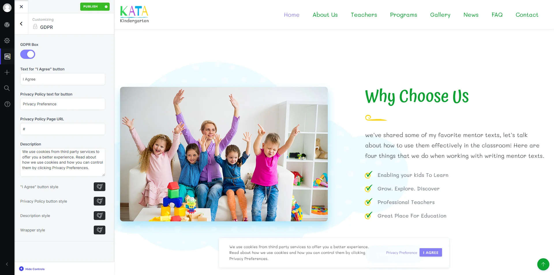
You can set up your very own GDPR module from here. All details within the module, including text and styling options, are configurable.
Maintenance Mode
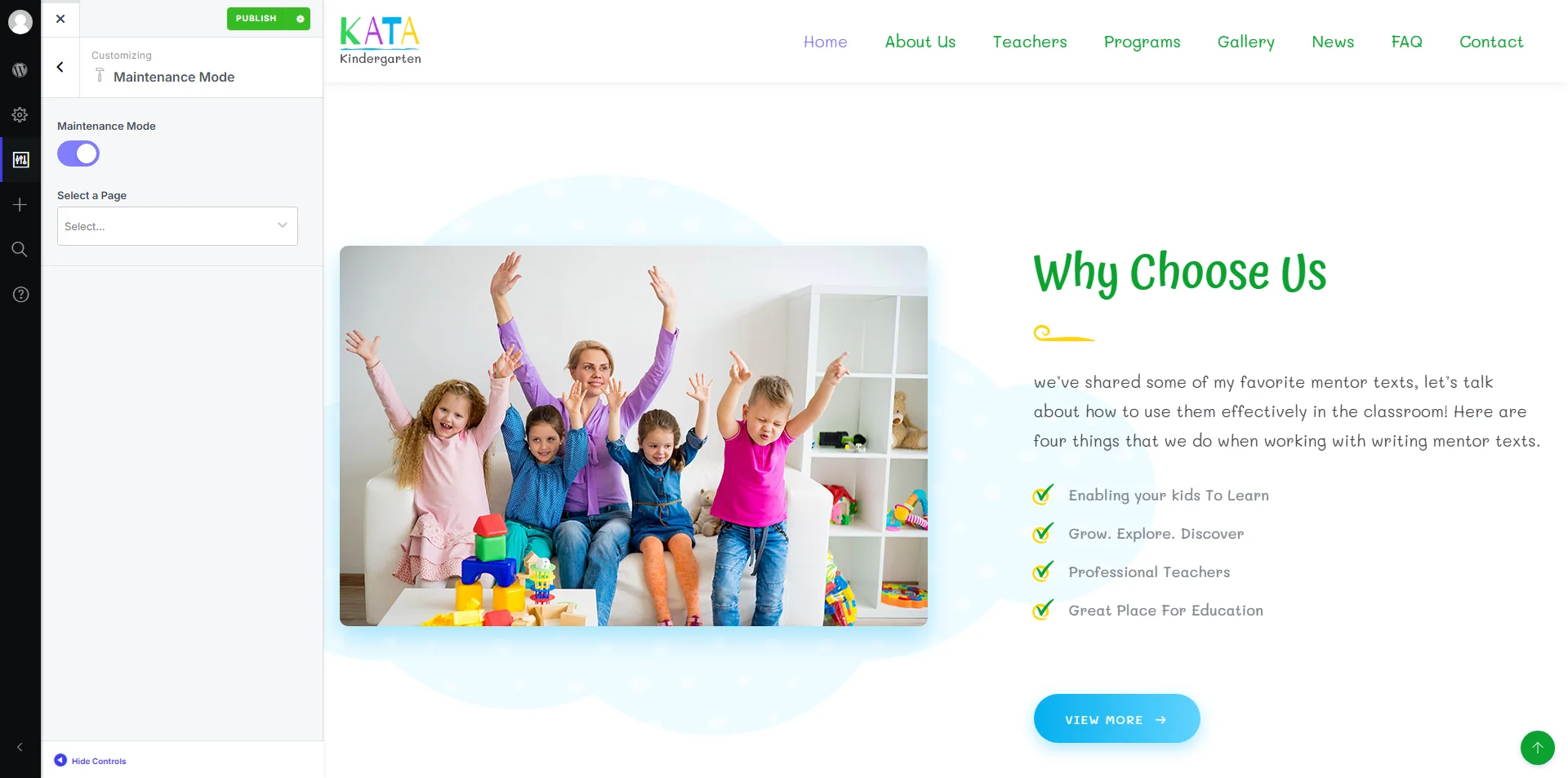
Kata has a feature called maintenance mode that allows you to redirect users to a temporary page while you’re still working on the design.
White Labeling
Kata also provides white labeling. This means that you can replace the default texts and logos with your own to fully personalize your website according to your brand. There is also the ability to hide special Kata post types and Admin panel items. You can even replace WordPress’s logo with your own logo on the login page. All these are customizable from here.

WooCommerce
In this section, you can configure the different sections of your WooCommerce shop and make any changes you want to publish on WooCommerce.
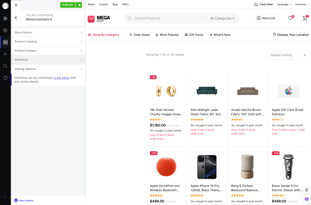
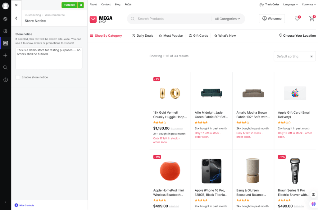
Store Notice: If this option is enabled, this text will be shown site-wide. You can use it to show events or promotions to visitors.
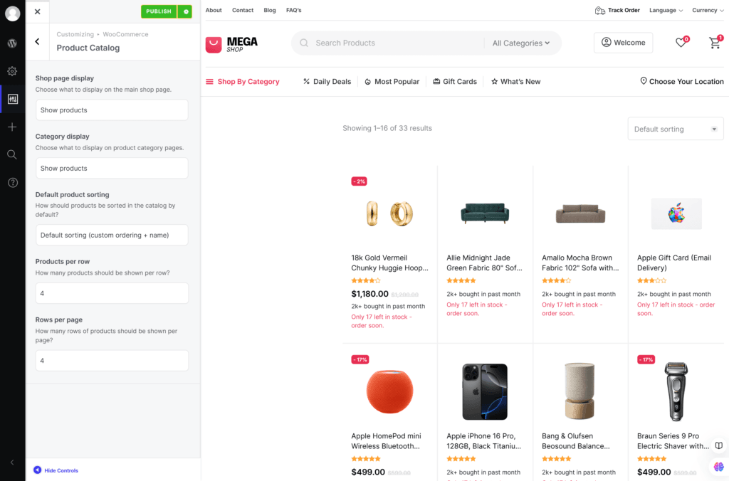
Product Catalog: In this section, you can configure your Product catalog pages and adjust various options.
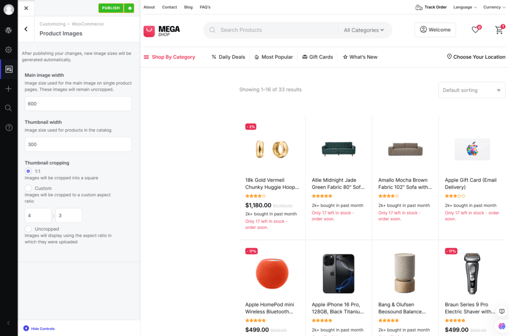
Product Images: In this section, you can Configure your product images and options.
Checkout: This section can be customized in the Editor with your active theme.
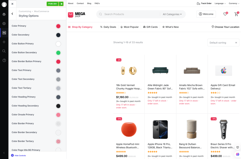
Styling Options: In this section, you can Customize your WooCommerce store’s appearance and adjusting colors, border radius, and font size.
Additional CSS
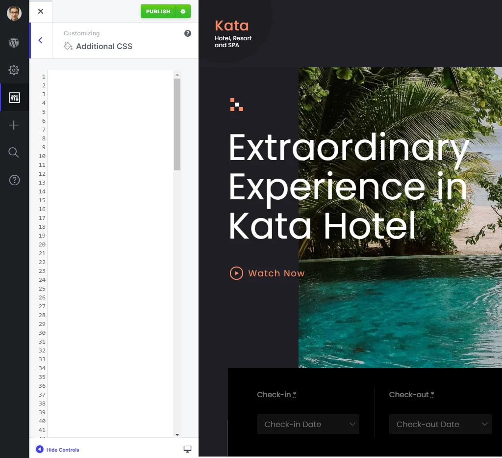
While the comprehensive Styler renders manual CSS entry unnecessary, we still offer the option for those who prefer to input their own CSS code.
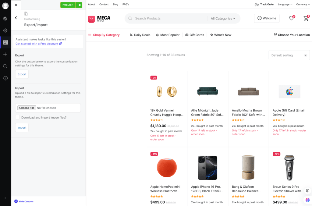
Export/Import
In this section, you can export all of your customizer settings and also import the exported settings.
