
Kata adds 3 viewports to Elementor, and as a result, you’ll gain access to a total of 6 sizes for different styles. Your website will also support more device outputs and will function differently on various screen sizes. These sizes are:
- Desktop (1920px)
- Laptop (1366px)
- Tablet Landscape (1024px)
- Tablet (768px)
- Mobile (480px)
- Small Mobile (320px)
In order to start using the Responsive design, you’ll first need to set the website’s container size from Theme Option (Link to Customize > Container)
In the Devices menu, there are different styler sizes for all kinds of devices with responsive design. You can exclusively style each device by choosing them from the menu since the Styler implements changes on the Desktop version by default. So make sure to choose your other devices as well.
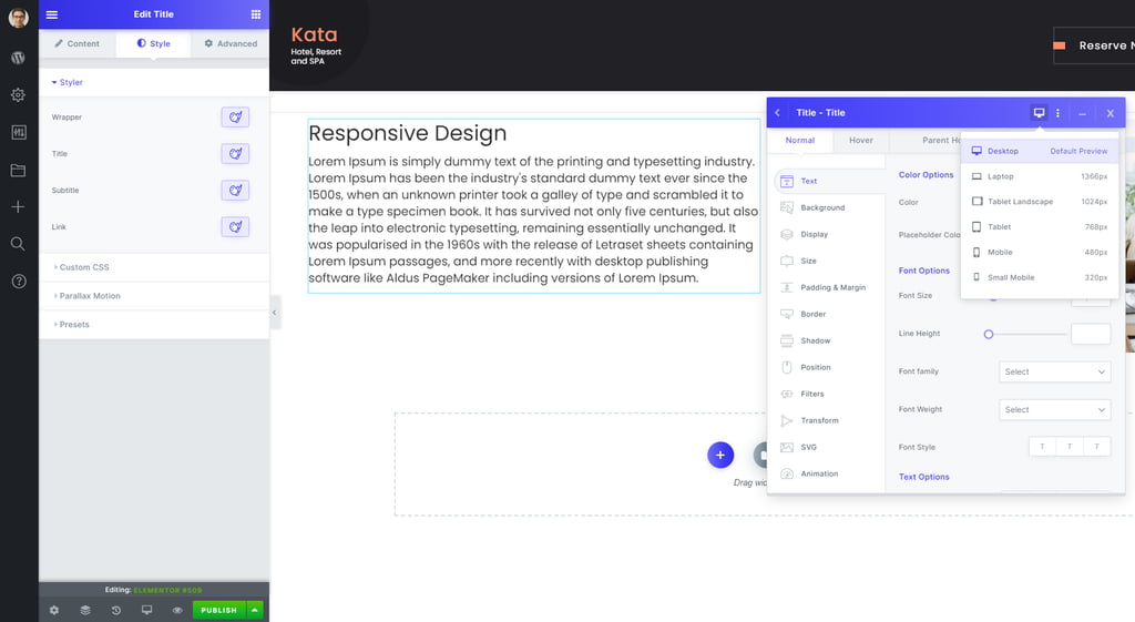
Let’s assume I’m in the Elementor editing environment, and I am to change the font size of a title in different devices. I’ve set it as 42px on desktop but want it to be much smaller on tablets. I choose Tablet from the Devices menu.

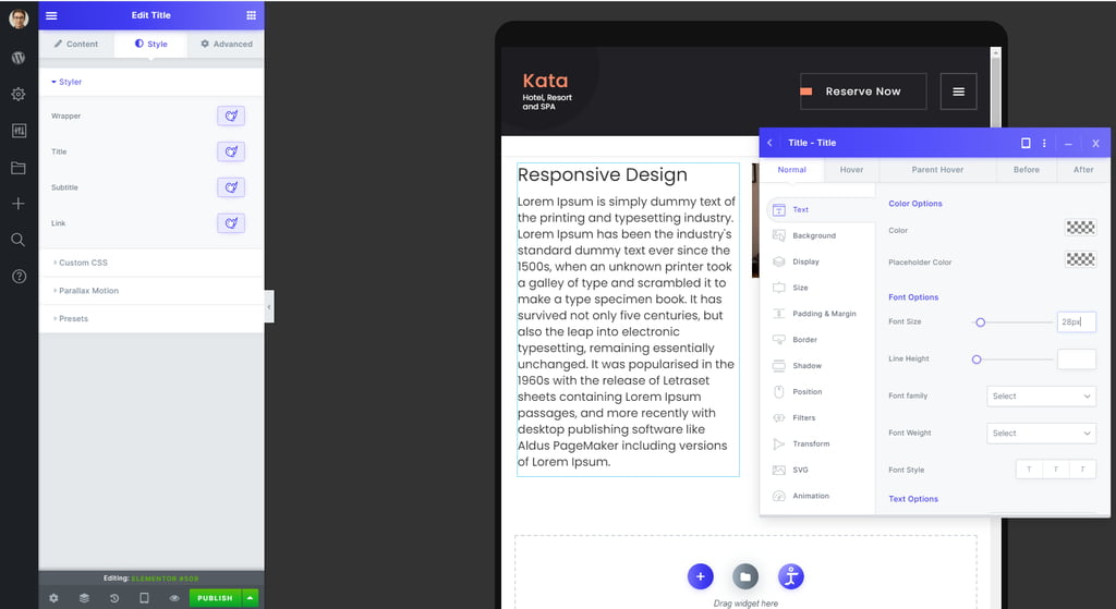
I set the font to 28px for tablet, and as you can see in the image below, the size of the title has decreased but only in Tablet view.
