
Kata Header Builder is a versatile tool designed to allow users to create and customize their website headers in Elementor’s editing environment using the Styler without requiring coding knowledge. Add your favorite widgets to create your own template. The designed template will then be considered your website’s main header and will be loaded on the top. It provides a drag-and-drop interface, multiple customization options, and predefined templates to make the header design process intuitive and efficient.
Note: One of Kata Header Builder’s unique characteristics is that widgets are positioned next to each other rather than under.
Here is an explanation of its features and functionalities:
1. Drag-and-Drop Editor
The Header Builder uses an intuitive drag-and-drop interface, enabling users to add, arrange, and resize elements like logos, menus, buttons, search bars, social icons, and more. You can position these elements in specific rows and columns for precise control over the layout.
2. Predefined Templates
Kata offers several ready-made header templates that you can import and customize. These templates are responsive and designed to suit various website types, such as blogs, eCommerce stores, or corporate sites.
3. Layout Customization
You can customize the header layout to match your website’s style:
Rows and Columns: Add multiple rows and columns to structure your header.
Width Settings: Adjust the width of the header, from full-width to boxed layout.
4. Styling Options
The builder includes comprehensive styling tools:
Spacing and Padding: Fine-tune margins and paddings for a polished design.
Colors and Backgrounds: Customize colors, and gradients, or add images as backgrounds.
Typography: Adjust font styles, sizes, and weights for text elements.
5. Dynamic Content Support
Kata’s Header Builder integrates with WordPress’s dynamic content functionality, allowing you to display personalized content based on the user’s profile, such as login/logout buttons or custom greetings.
6. Advanced Features
Mega Menu: Add advanced navigation options with the Mega Menu feature, displaying categories, images, and widgets.
Custom Code: Insert HTML, CSS, or JavaScript snippets for advanced customization.
Third-Party Integrations: Compatible with popular plugins like WooCommerce, making it easy to add shopping cart icons or user account links.
7. Export and Import
Save your header designs as templates to reuse on other websites or different sections of your current site. You can also import headers shared by other Kata users or provided by the theme developers.
Accessing Header Builder
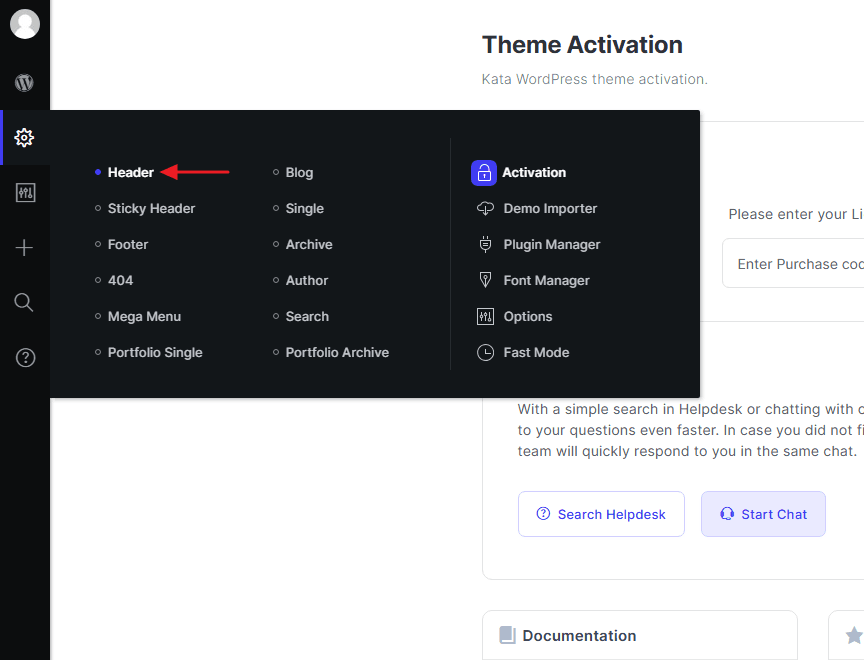
To access the Header Builder, go to wp-admin > Kata > Header.
Now, you’re in Kata Header Builder. The Elementor editor will open by default, and you’ll be greeted with the Kata logo, your website menu, and multiple header elements, including a search icon, user account, wishlist, and shopping cart. On the left side, you can see Elementor widgets specific to the Kata Header Builder.
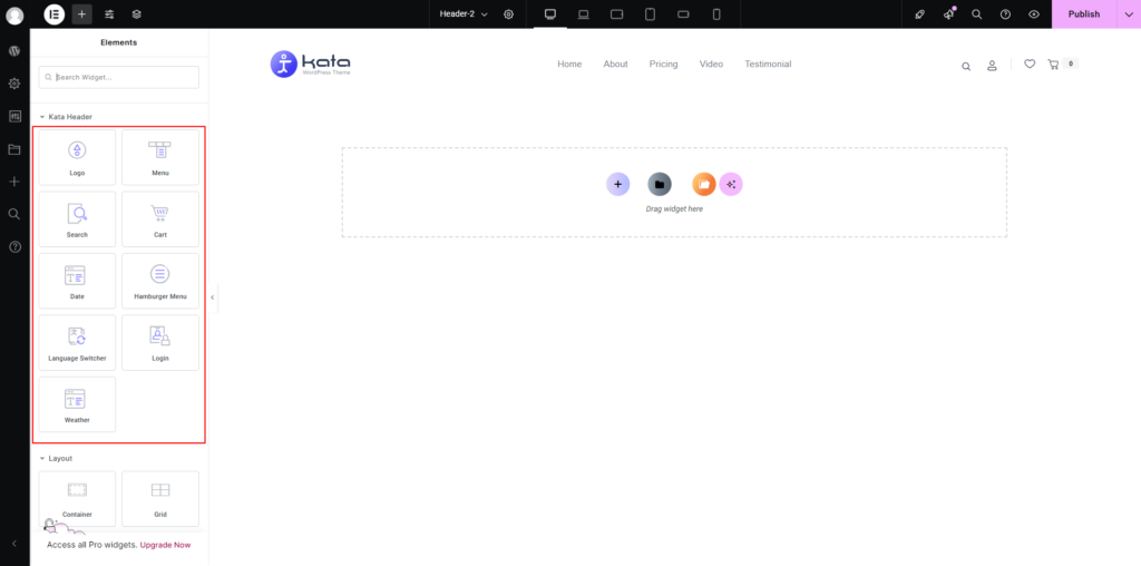
These are the widgets usually used in the website’s header. However, you can use any widgets you want in the header.
- Kata Logo
- Kata Menu
- Kata Search
- Kata Cart
- Kata Date
- Kata Hamburger Menu
- Kata Language Switcher
- Kata Login
- Kata Weather
Add your desired element to the header section and begin designing.
Header Responsive
The design and look of your header would need to be different for different devices since each has a different screen size. To this end, create another section under your header section but design it for small screen sizes.
Menu items are usually displayed differently on mobile devices. A toggle replaces header items so that as soon as you tap it, the whole menu will be revealed.
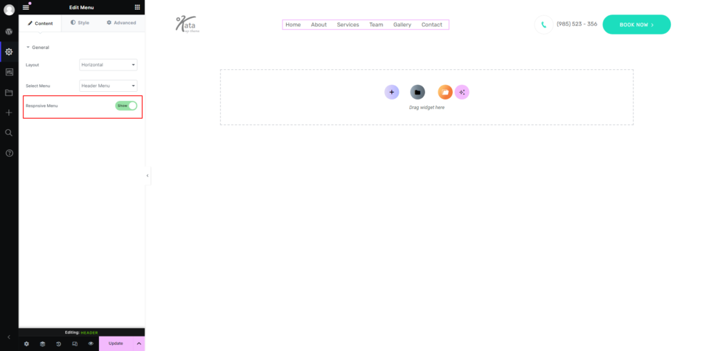
The Kata Menu element has an option for a responsive menu that has a default template once enabled.
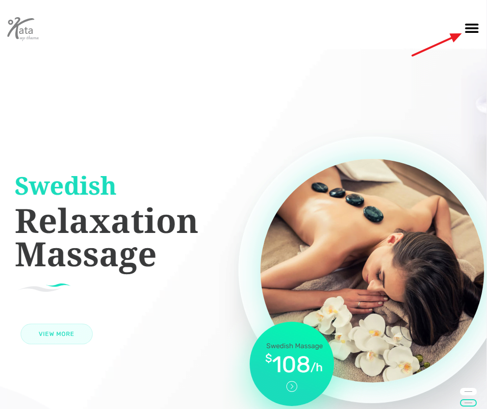
This design cannot be customized currently. So if you want to have a more advanced responsive menu, you’ll need to use the Kata Hamburger Menu element.
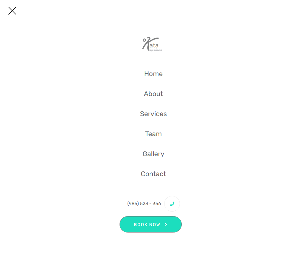
Create a section below the main section and place the Kata logo, Kata Hamburger Menu, and other elements in it.
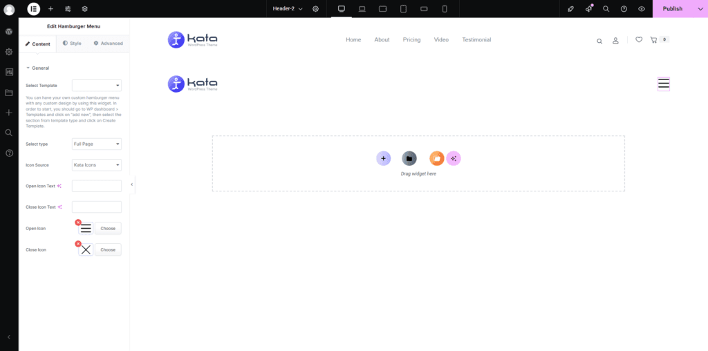
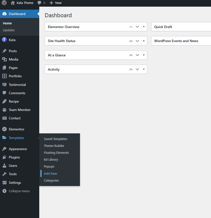
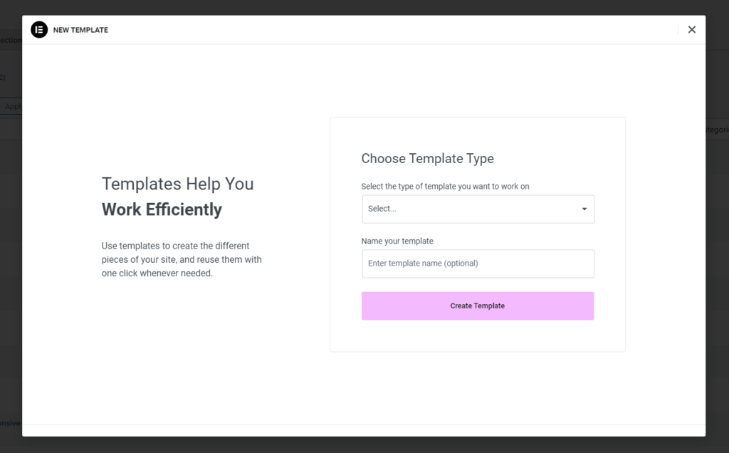
Now you need to design a content Elementor Template that can be displayed by tapping on the toggle. Open your WordPress menu from the admin panel and go to Templates > Add New to create a template in the form of a section.
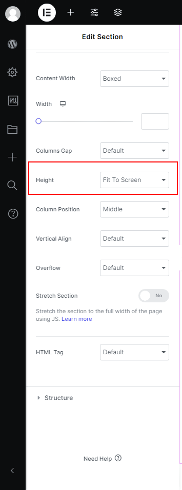
Set your Elementor Section’s height to Fit to Screen so that it fills the full height of the user’s screen.
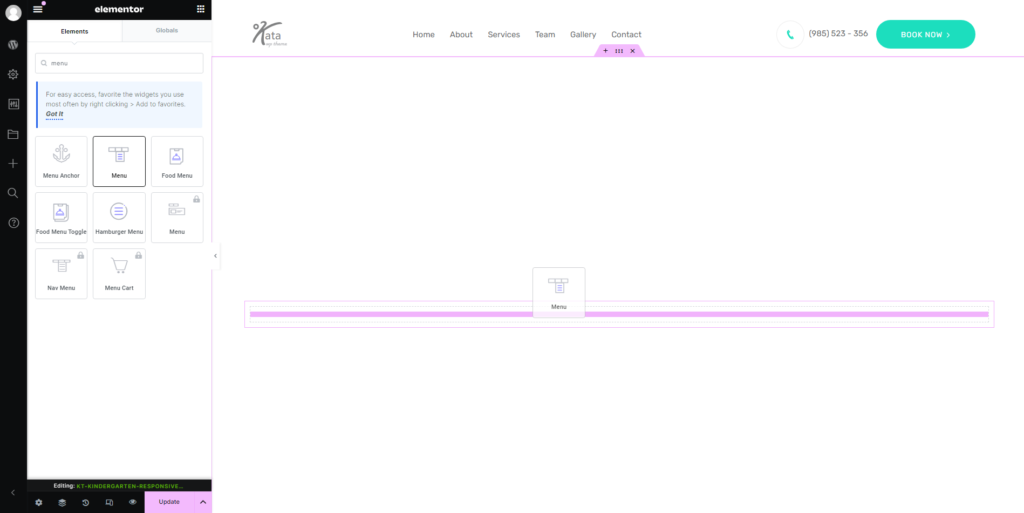
Now, drag a Kata Menu element and add it to your section.
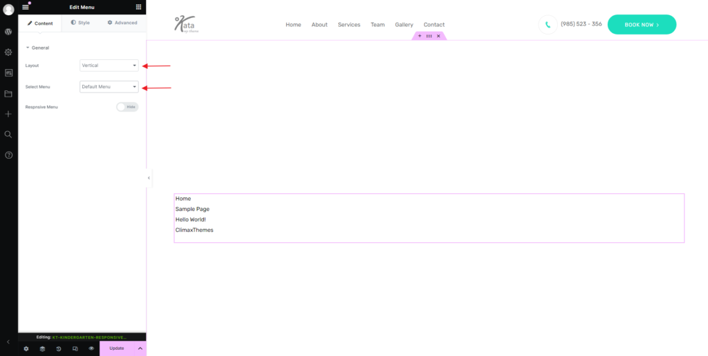
Set the layout to Vertical and select the menu that you want to be displayed.
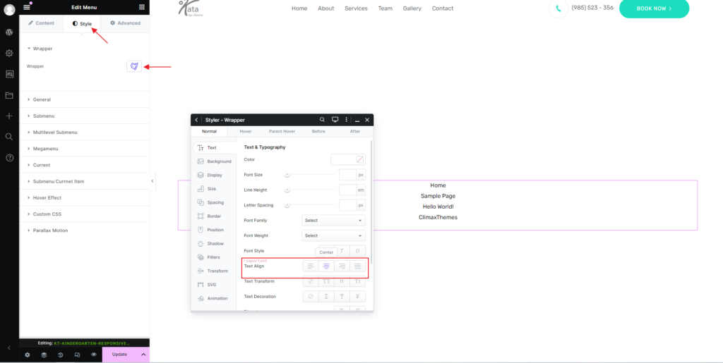
Now, it’s time to style this menu using the Styler. Go to the Style tab and open the Wrapper’s styler by clicking on the icon in front of it. Go to the Text tab in the Styler and change the text alignment to Center. This way your menu items will be in the middle.
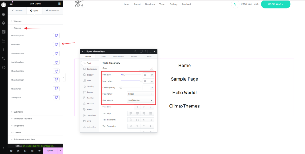
Now, click on General and open the Styler for a menu item you want to customize.
Once you’re done, make sure to save the template, then go to the Kata Hamburger Menu element and select the template you just saved.
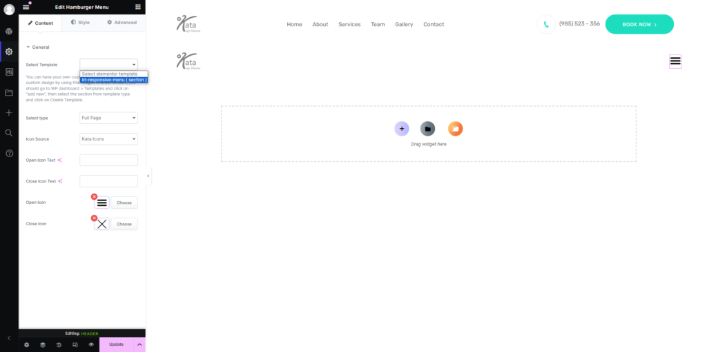
Implementing the Toggle Menu is done.
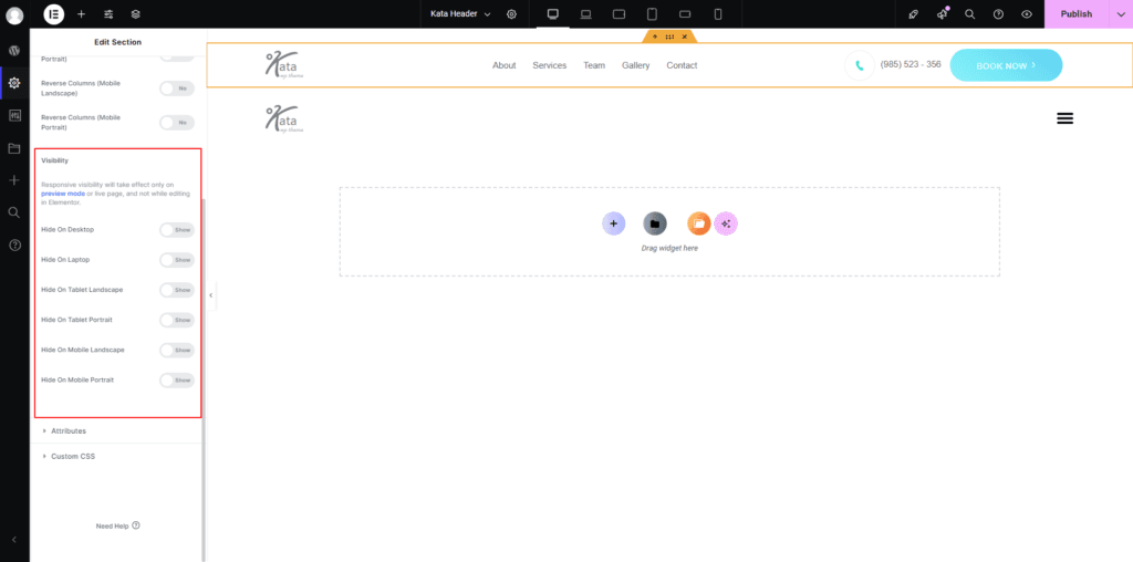
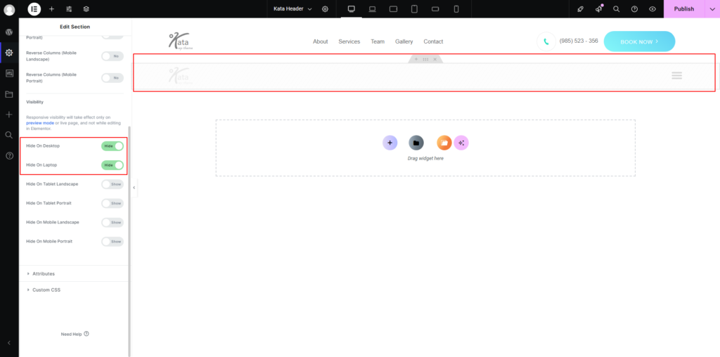
Responsive Settings
To manage which section is displayed on specific devices or screen sizes, use Responsive Settings in Elementor.
Follow these steps to configure the responsive settings:
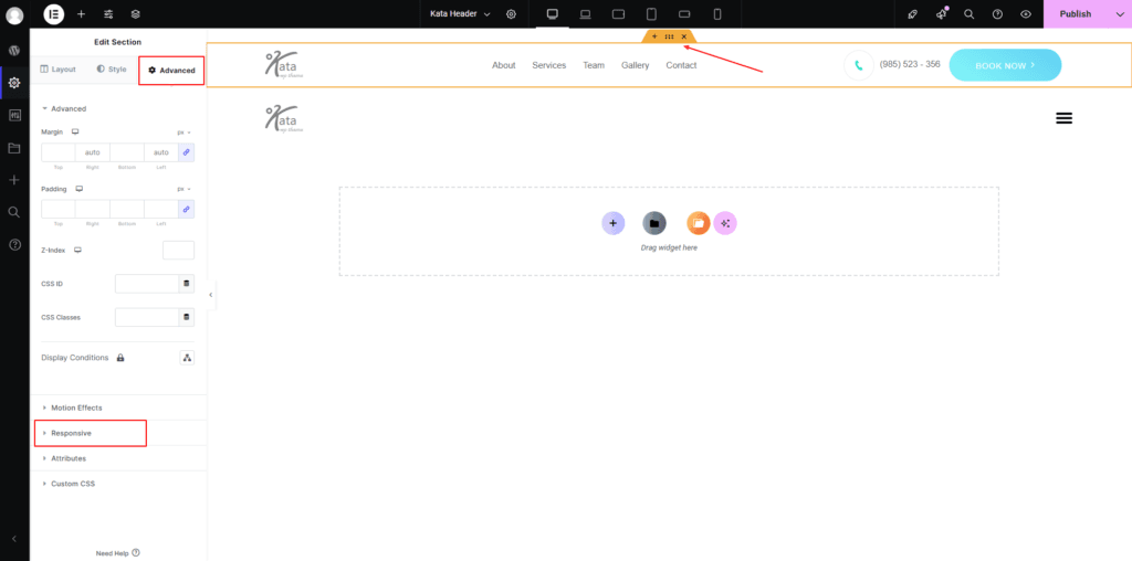
1. Access the Responsive Settings
Select the section you want to configure.
In the Elementor sidebar, go to the Advanced tab.
Scroll down to find the Responsive Settings section.
2. Visibility Options
Hide on Desktop: Hides the selected element on devices with large screens (e.g., desktops).
Hide On Laptop: Hides the selected element on devices classified as laptops. This usually applies to screens ranging between 992px and 1200px. The exact range may depend on custom breakpoint settings.
Hide On Tablet Landscape: Hides the selected element when viewed on tablets in landscape orientation. This applies to screen widths ranging between 768px and 992px.
Hide On Tablet Portrait: Hides the selected element when viewed on tablets in portrait orientation. This typically applies to screen widths between 600px and 768px.
Hide On Mobile Landscape: Hides the selected element on mobile devices when in landscape orientation. This generally applies to screens between 480px and 600px.
Hide On Mobile Portrait: Hides the selected element on mobile devices when in portrait orientation. This typically applies to screens smaller than 480px.
To apply the setting, simply toggle the visibility for each device.
3. Adjusting Layouts for Different Devices
Switch to Device View: At the top of the Elementor panel, click on the responsive mode icon.
Select Desktop, Tablet, or Mobile to see how the design looks on each device.
4. Testing and Final Adjustments
Use the Preview button to check how the site appears on different devices.
Test thoroughly to ensure all elements are properly aligned and visible according to your settings.
