
In this article, we delve into the process of styling columns using the Styler tool in the Kata theme. This guide will provide comprehensive steps and insights to help you leverage Styler’s advanced capabilities to create responsive and visually engaging layouts.
Understanding the Styler Tool
The Styler is an advanced visual CSS editor integrated into the Kata theme. Unlike traditional methods requiring manual CSS coding, Styler offers real-time, intuitive design modifications. Key features include:
- Device-Specific Adjustments: Kata’s six responsive sizes—Small Mobile, Mobile, Tablet, Tablet Landscape, Laptop, and Desktop—offer unparalleled granularity.
- Visual Editing: Instantly preview changes to columns and layouts without switching between the editor and frontend.
- Enhanced Customization: Easily adjust widths, spacing, alignment, and more.
This extended flexibility ensures your website remains visually consistent across all devices.
Why Use Styler Over Elementor for Column Styling?
While Kata is designed to work seamlessly with Elementor, there are significant advantages to using Styler for column adjustments:
- More Breakpoints: Elementor provides only three responsive breakpoints by default (Desktop, Tablet, Mobile). Styler supports six, including Laptop and Tablet Landscape, offering greater precision.
- Optimized Responsiveness: Styler ensures layouts adapt perfectly to all screen sizes. Elementor’s limitations can lead to design inconsistencies.
- Unified Styling: Avoid potential conflicts by relying solely on Styler for column adjustments in the Kata theme.
For optimal results, we recommend avoiding Elementor’s column styling features when using Kata.
Step-by-Step Guide to Styling Columns with Styler
1. Open the Styler Tool
- Log in to your WordPress dashboard.
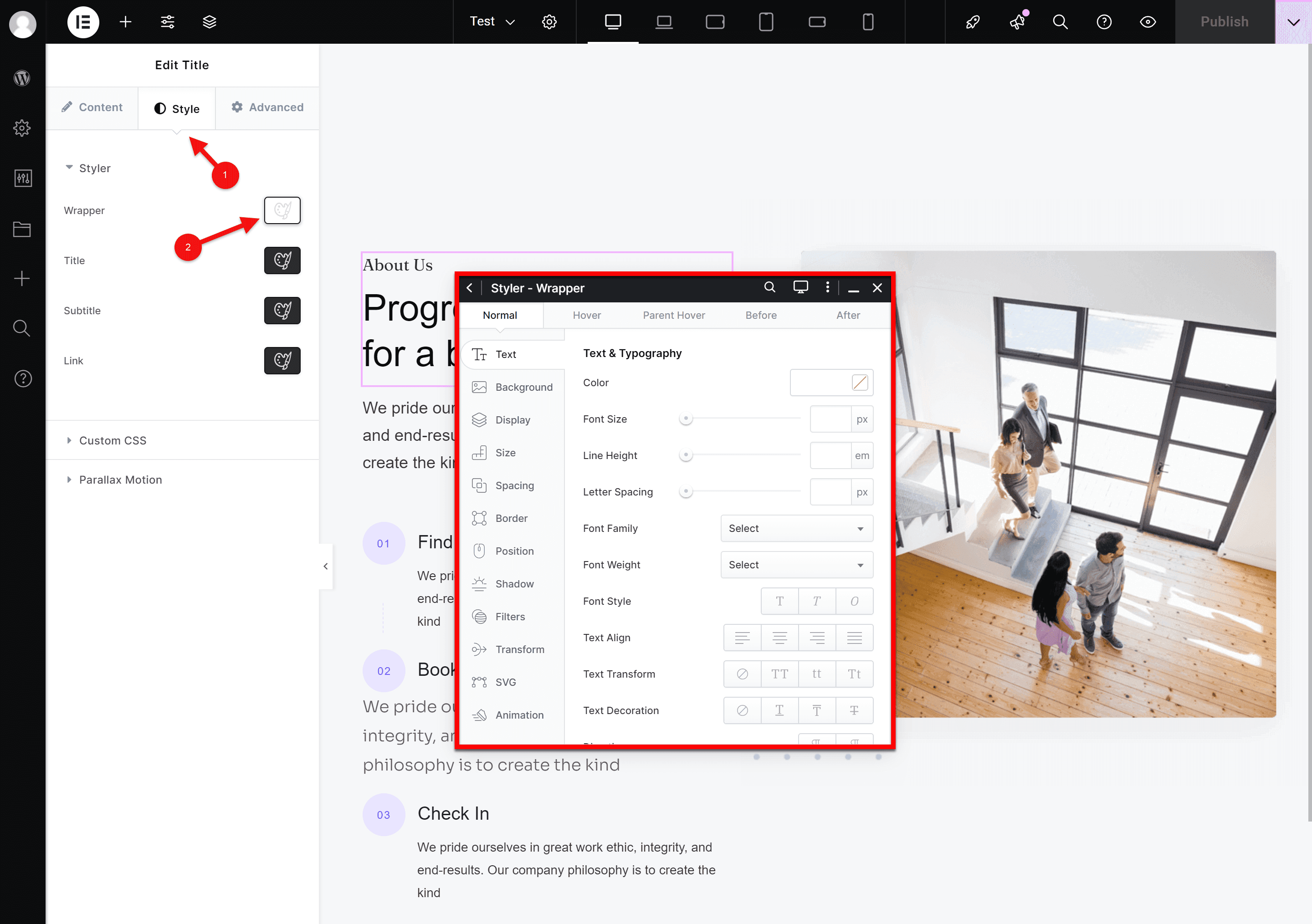
- Go to the page you wish to edit, select the desired element, and click on the Style tab located on the left side of the page. Here, you will have access to the styling tools.
2. Identify the Section and Column
Hover over the section you wish to modify; Styler will highlight individual columns.
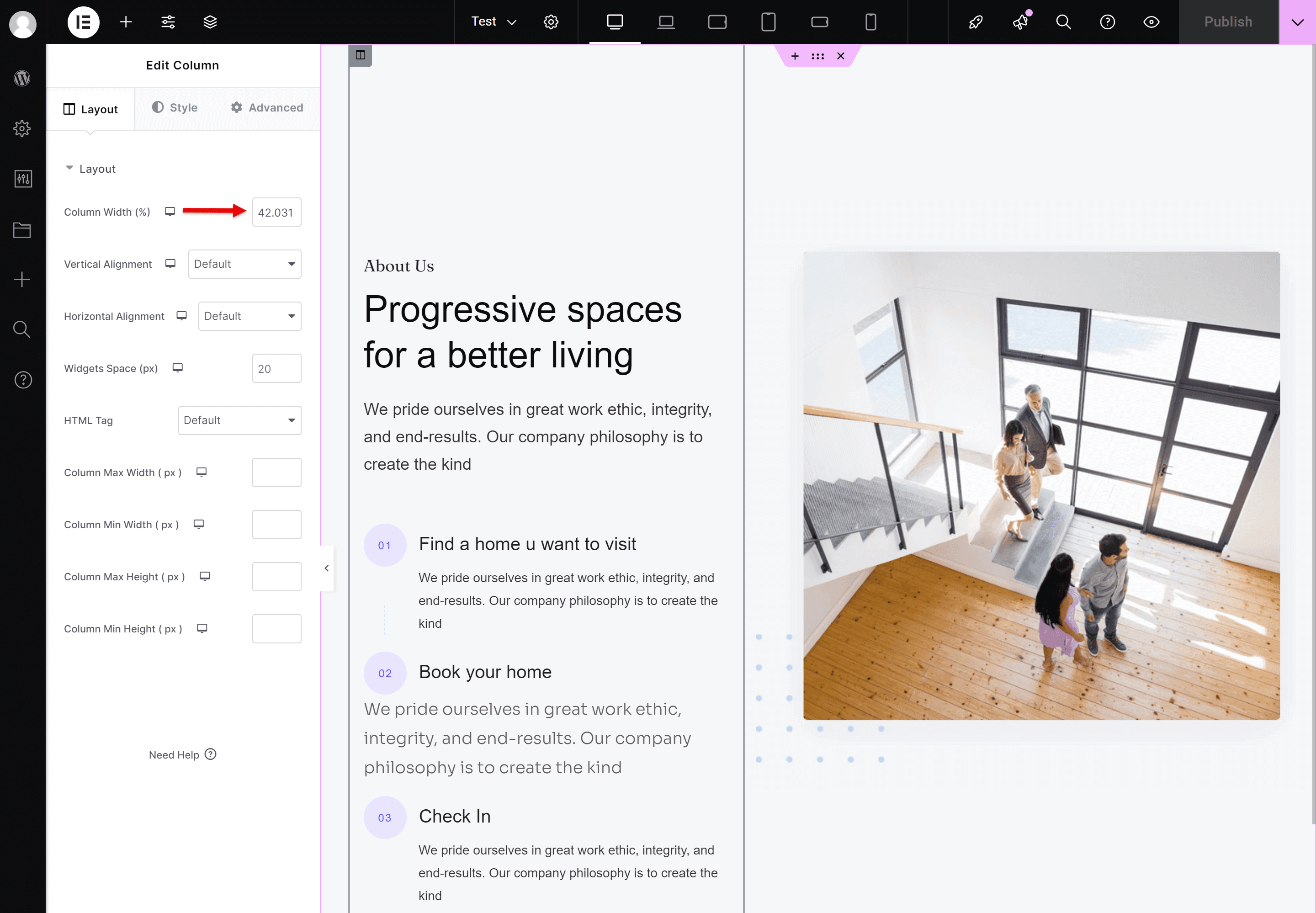
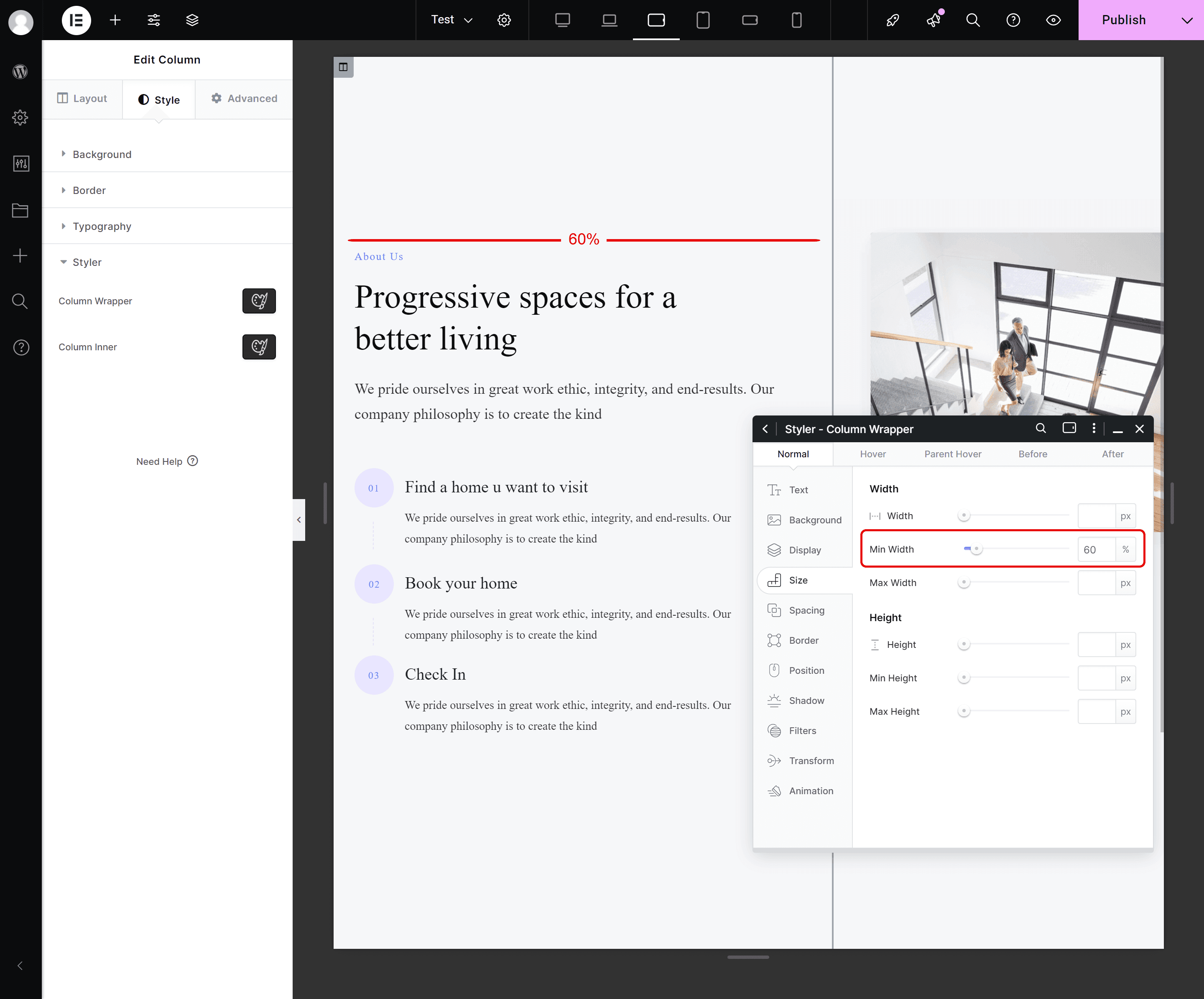
3. Adjust Column Width
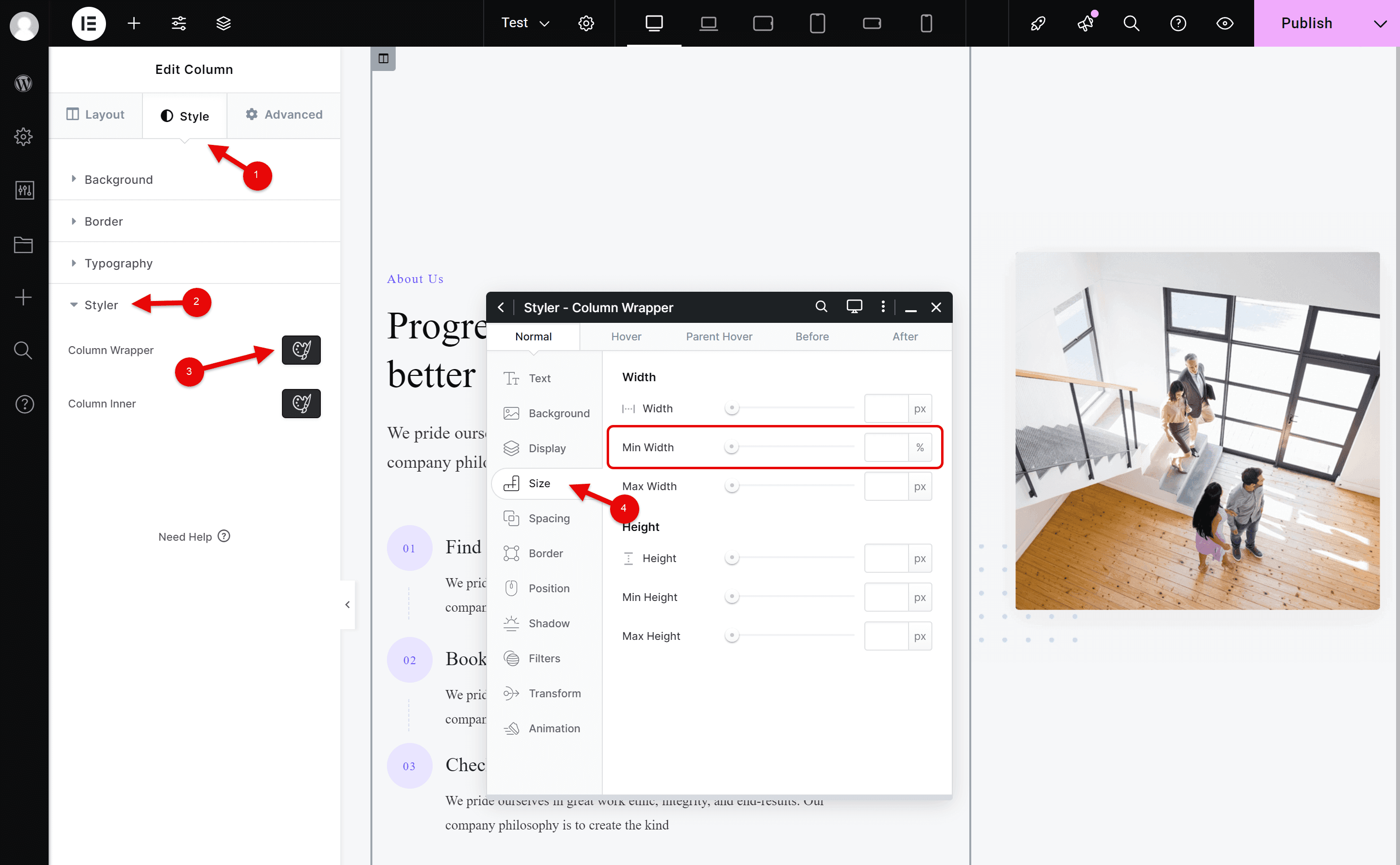
- Go to Style > Styler > Column Wrapper > Size.
- Use the slider to adjust the column width interactively or enter an exact value (e.g., 50% or 300px).
- Preview the changes live to ensure the layout aligns with your expectations.
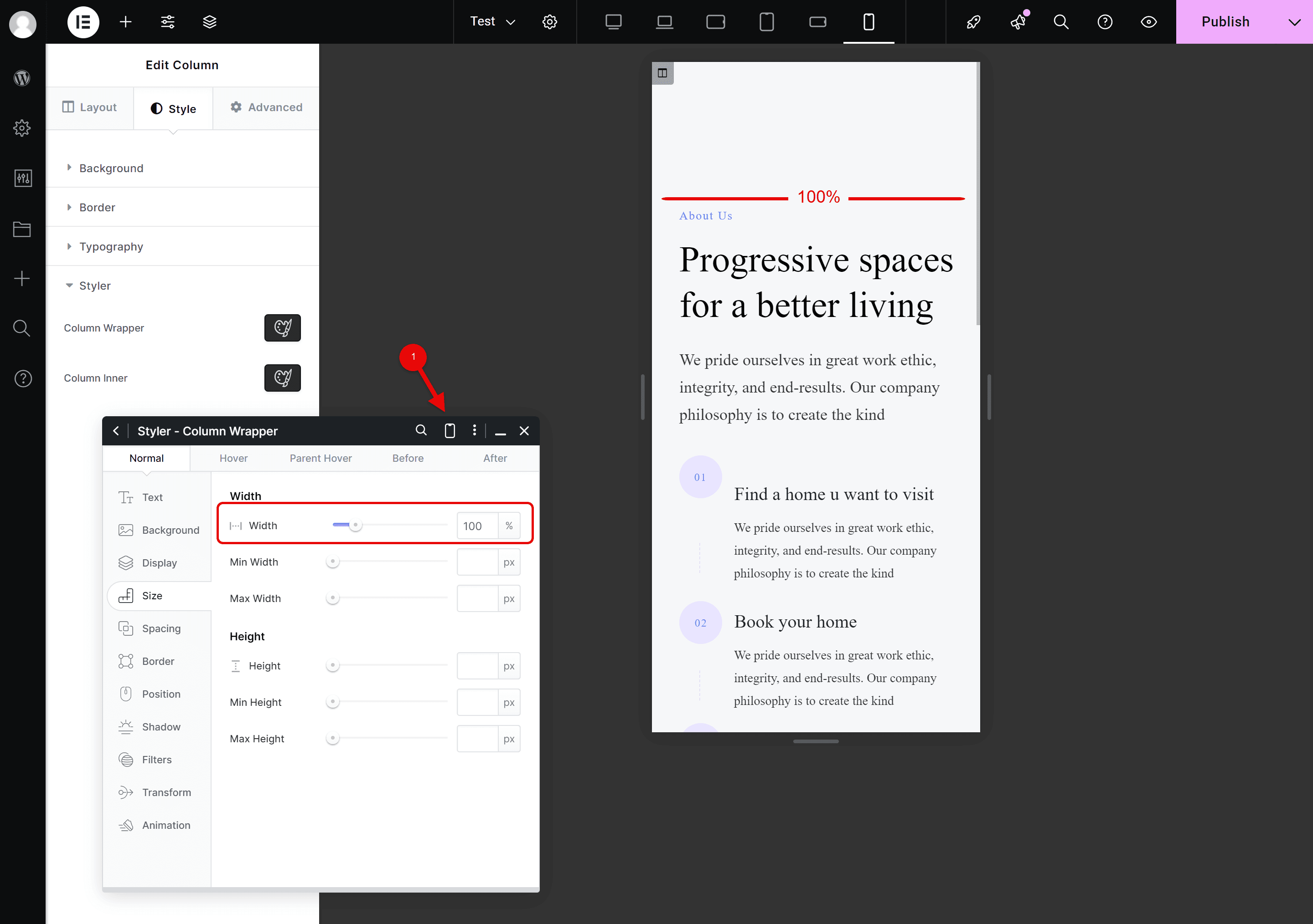
4. Customize for Specific Devices
Styler allows you to style columns uniquely for each of its six responsive breakpoints:
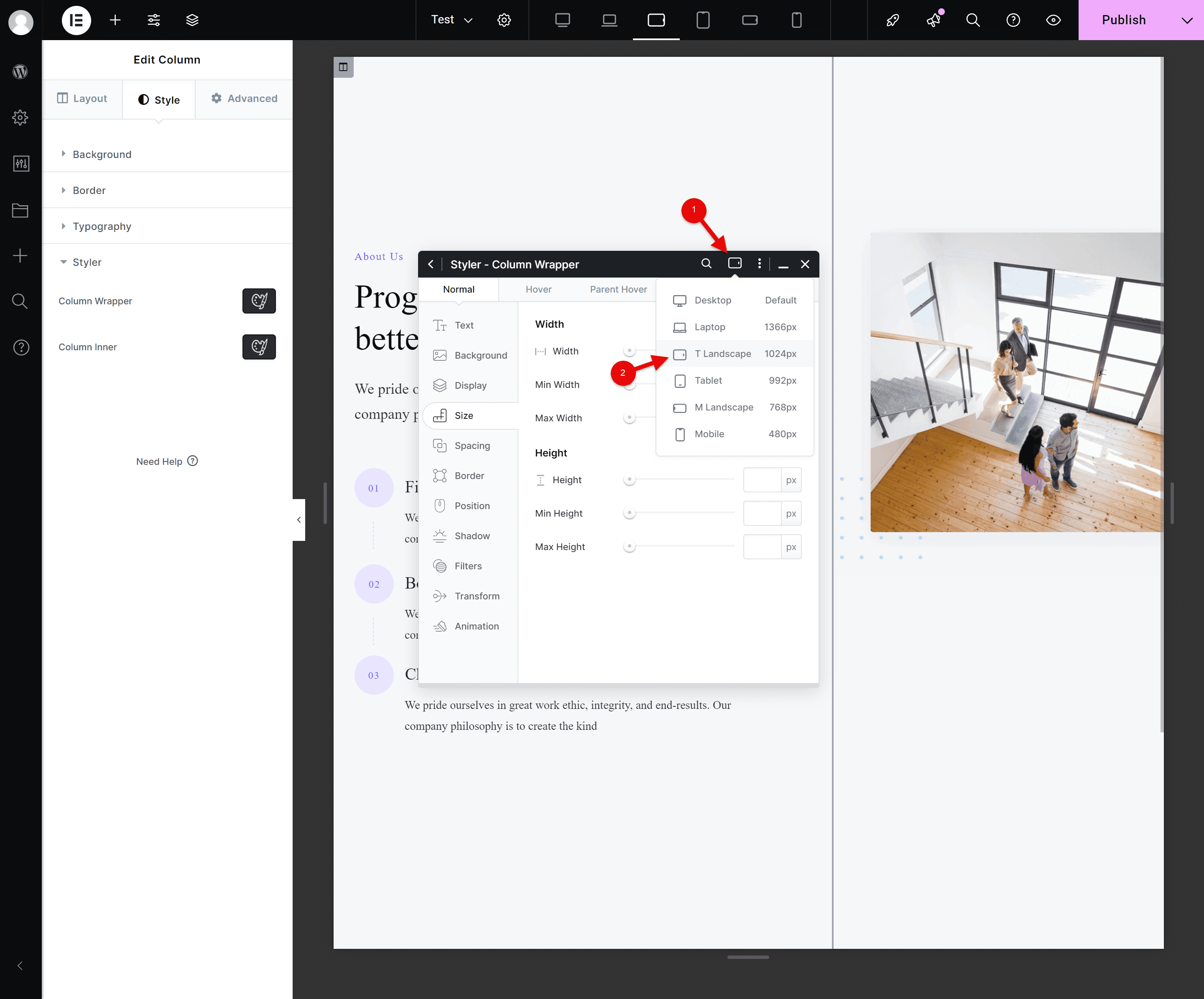
- Open the Devices Menu and select the desired size (e.g., Tablet Landscape, Laptop).
- Modify the column width under Size > Width. For example, change the width from 44% to 60% for Tablet Landscape.
- Repeat this process for other breakpoints as needed.
For smaller sizes like Tablet, Mobile, and Small Mobile, Styler automatically defaults the column width to 100%, ensuring it fills the screen for a mobile-friendly layout.
5. Save and Review
- Save your changes to apply them globally.
- Preview the page across different devices to confirm consistency and responsiveness.
Key Takeaways
- Avoid Elementor for Column Styling: Rely on Styler to utilize Kata’s six breakpoints effectively and avoid conflicts.
- Leverage Responsive Defaults: Smaller breakpoints (Tablet, Mobile, Small Mobile) default to 100% width, saving you time.
- Ensure Consistency: Preview and fine-tune your layout for each device size to maintain a professional appearance.
Flex vs. Grid: Choosing the Right Layout in Elementor
Flexbox is perfect for simple, single-axis layouts (rows or columns), making it ideal for responsive design. Grid excels in creating complex, two-dimensional structures with precise control over rows and columns. Use Flexbox for streamlined layouts and Grid for intricate, multi-dimensional designs. Choose based on your project’s needs for optimal results!
For a more in-depth understanding, you might find these articles useful
Conclusion
Kata’s Styler tool empowers you to create dynamic, responsive column layouts with precision and ease. Whether adjusting widths, aligning content, or ensuring device-specific consistency, Styler delivers unmatched flexibility. By following this guide, you can design visually stunning pages that perform flawlessly across all devices.
