
Kata’s Styler is an exceptional tool that empowers users to design web pages precisely as they envision. With its intuitive interface and robust features, it caters to both novice and professional designers. In this article, we’ll delve into the key differences between the Free and Pro versions of Kata Styler, highlighting how each caters to diverse design needs.
Getting Started with Kata Styler
To begin using Kata’s Styler, follow these simple steps:
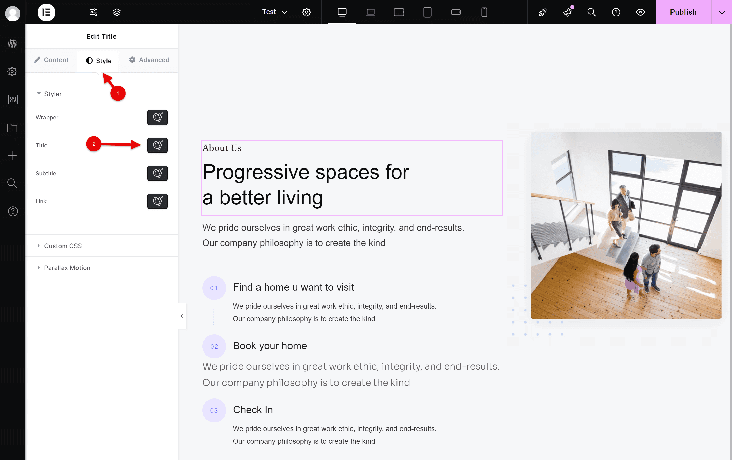
- Navigate to the Styler tab by clicking on “Styler”.
- Select the
 icon of the element you wish to customize.
 icon of the element you wish to customize.
Key Differences: Free vs. Pro Versions
| Features | Pro | Free |
| Normal | ✓ | ✓ |
| Hover | ✓ | ✓ |
| Parent Hover | ✓ | ✗ |
| Before | ✓ | ✗ |
| After | ✓ | ✗ |
| Text | ✓ | ✓ |
| Background | ✓ | ✓ |
| Display | ✓ | ✓ |
| Size | ✓ | ✓ |
| Padding & Margin | ✓ | ✓ |
| Border | ✓ | ✓ |
| Shadow | ✓ | ✓ |
| Position | ✓ | ✓ |
| Filter | ✓ | ✗ |
| Transform | ✓ | ✗ |
| SVG | ✓ | ✓ |
| Animation | ✓ | ✓ |
| All Responsive Devices | ✓ | ✓ |
| Styler Copy / Paste | ✓ | ✓ |
Filter (Pro Version Only)
The Filter feature in the Pro version allows you to apply graphical filters to an element. This includes adjustments like blur, brightness, contrast, grayscale, and sepia tones. Filters can give your website a unique, artistic look, or they can be used to highlight certain areas of a page. For example, you can apply a blur effect to background images or use grayscale on an image until a user hover over it, creating an interactive visual effect.
In the Free version, this feature is unavailable, limiting your ability to apply advanced visual effects without coding knowledge.
Transform (Pro Version Only)
The Transform feature in the Pro version enables users to manipulate an element’s position, scale, rotation, and skew. This allows for more dynamic layouts and animations that enhance the user experience. With the Transform feature, you can rotate an element at a specific angle, scale it to create emphasis, or even skew it to create unique visual effects that make your design stand out.
In contrast, the Free version does not include the Transform feature, meaning your design options for element positioning and animations are more limited. Users of the Free version will have to rely on other techniques to achieve similar effects, which might require more manual adjustments or additional CSS.
Parent Hover (Pro Version Only)
The Parent Hover feature in the Pro version is an exciting tool for creating interactive designs. It allows you to apply styles to a child element when the user hovers over the parent element. This feature is ideal for creating hover effects such as changing the color or visibility of child elements like buttons, images, or text when the user interacts with the parent container.
For example, you can set a hover effect on a container that changes the opacity of a text block. This type of interactivity makes your website more engaging and visually appealing.
Unfortunately, the Parent Hover functionality is not available in the Free version. Users who need this type of interaction will have to look for alternatives or implement custom code.
Before and After (Pro Version Only)
The Before and After feature in the Pro version allows you to add content or design elements before or after the main content of an element. This can be used to create stylish effects such as icons, text, or images that appear before or after the main content. It’s a great way to add decorative elements or design details that enhance the user experience without overwhelming the primary content.
For example, you can add icons or decorative lines before and after titles or paragraphs to make them stand out. This feature provides greater flexibility for designers looking to create sophisticated layouts with minimal effort.
The Free version does not include the Before and After feature, so users will need to find other ways to achieve similar effects, which might involve more manual adjustments or additional coding.
Maximizing Your Design Potential
For users who demand greater flexibility and efficiency, the Pro version of Kata Styler is a worthy investment. Its advanced responsivity settings and style management tools enhance productivity, enabling designers to create polished, responsive web pages effortlessly.
Meanwhile, the Free version remains a powerful tool for those starting their design journey, offering a solid foundation for crafting visually appealing pages.
Conclusion
Kata Styler’s Free and Pro versions cater to a wide range of users, from beginners exploring design possibilities to seasoned professionals seeking advanced tools. By understanding the distinctions between the two, you can choose the version that best suits your needs and elevate your web design projects to new heights.
