
With the Kata theme, you can design headers optimized for various screen sizes, creating an adaptive user experience. For an enhanced mobile experience, use the Kata Hamburger Menu element to design a more advanced responsive menu. This guide provides step-by-step instructions on creating a mobile-friendly header, building an Elementor template, and managing visibility settings.
Create a Mobile-Optimized Header Section
Add a New Header Section for Mobile Devices
Under your existing header section, create an additional section. This section will be customized exclusively for smaller screens to ensure a better fit.
Add Core Elements to the Mobile Header
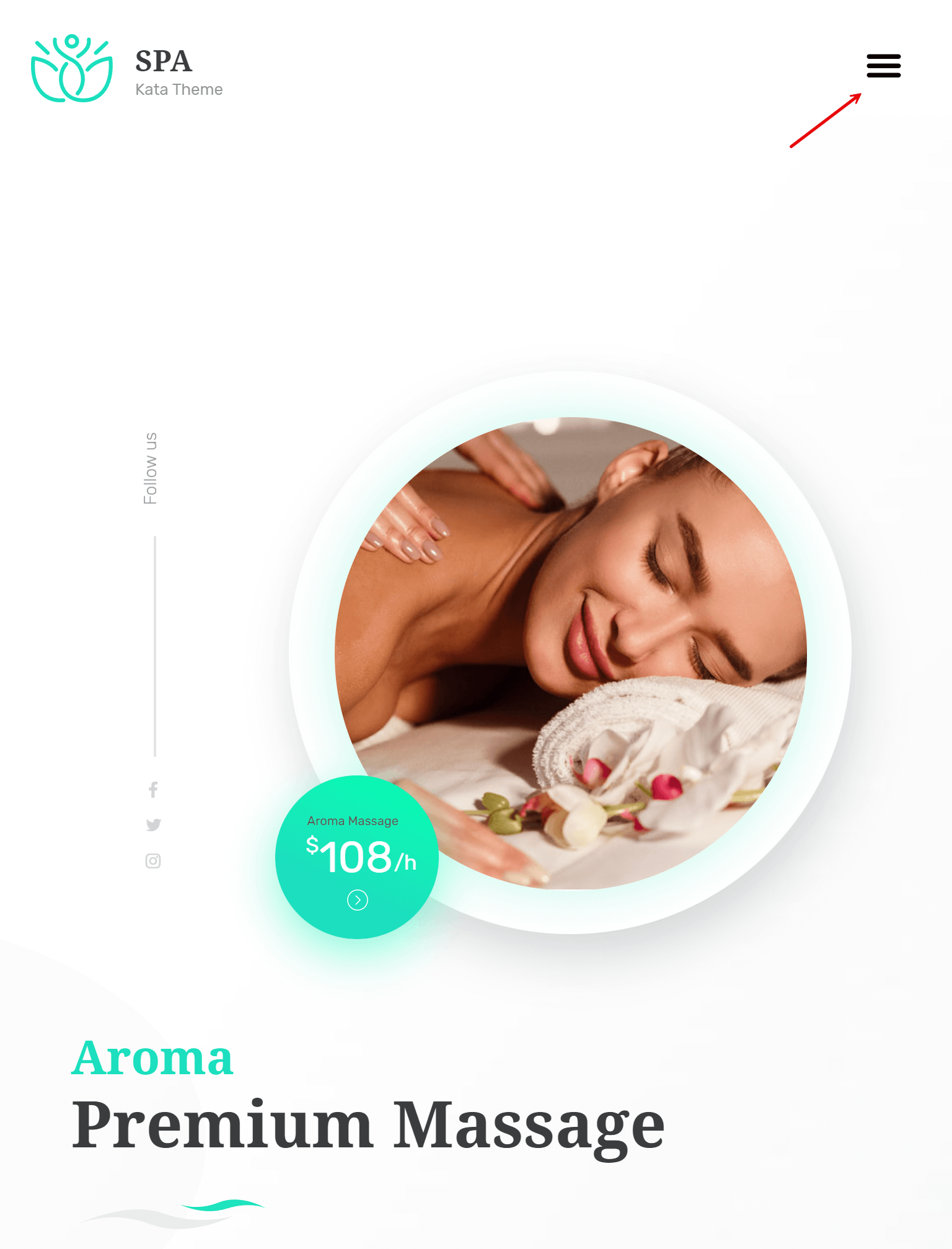
In this new section, place essential elements like the Kata Logo and Kata Hamburger Menu. This setup ensures that mobile users can access the main navigation with a simple toggle.
Build a Toggle Menu Template
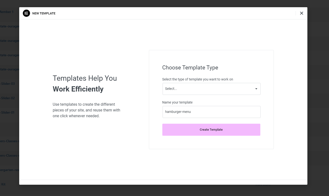
Create a New Elementor Template
To set up the content displayed when the toggle is tapped, go to WordPress Admin > Templates > Add New. Choose the Section template type and create a new template specifically for your mobile menu.

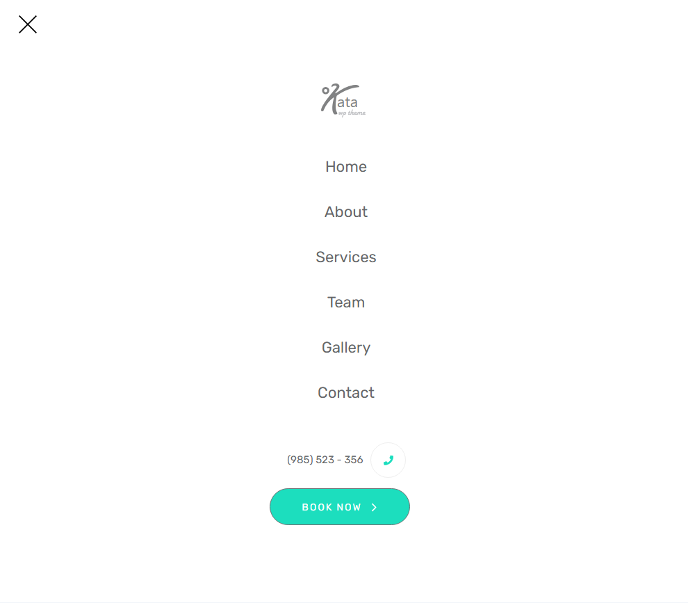
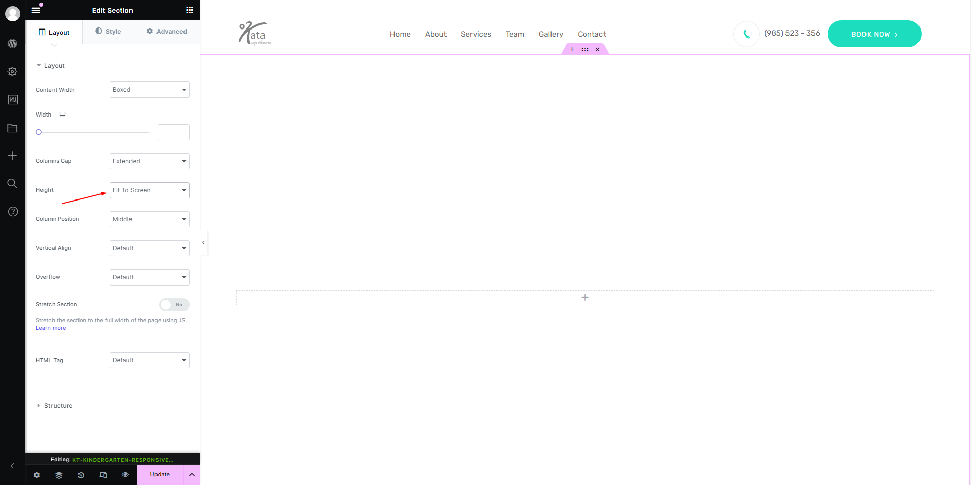
Set the Section’s Height to Fit the Screen
In the Elementor editor, set the section height to “Fit to Screen” to make sure the menu fills the entire height of the device’s screen when opened.
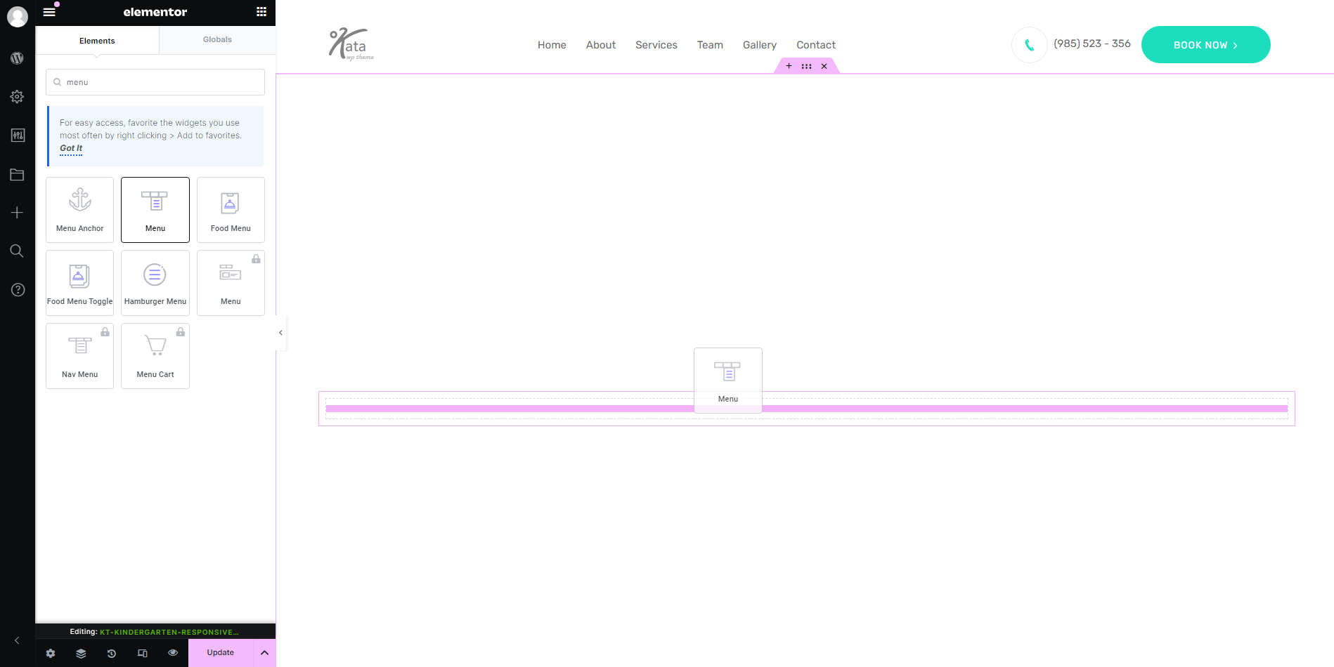
Add the Kata Menu Element and Customize Layout
Drag the Kata Menu element into this section, setting its layout to Vertical for a streamlined, stacked appearance that works well on mobile.
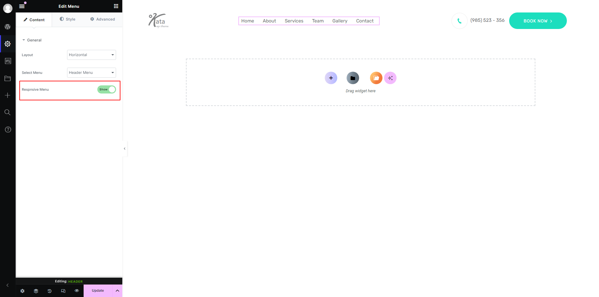
Choose the Correct Menu to Display
Select the desired menu from the dropdown options so that it’s linked to this mobile-friendly menu template.
Now, it’s time to style this menu using the Styler. Go to the Style tab and open the Wrapper’s styler by clicking on the icon in front of it. Go to the Text tab in the Styler and change the text alignment to the Center. This way, your menu items will be in the middle.
Style the Menu with the Styler Tool
Align Menu Items
In Elementor’s Style tab, open the Styler for the Wrapper by clicking the icon next to it. Under the Text section, set the text alignment to Center to ensure the menu items are neatly aligned.
Customize Individual Menu Items
Click General within the Styler to access individual menu items. Here, you can adjust colors, fonts, padding, and other styling options to match your brand’s aesthetics.

Save the Template
Once you’ve finished styling, save the template. This mobile menu is now ready to be connected to the Kata Hamburger Menu element.
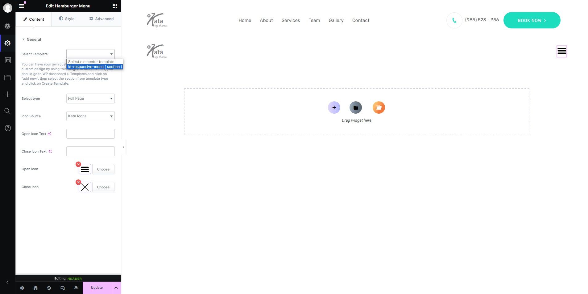
Link the Hamburger Menu to the Template
Select Your New Template in Kata Hamburger Menu
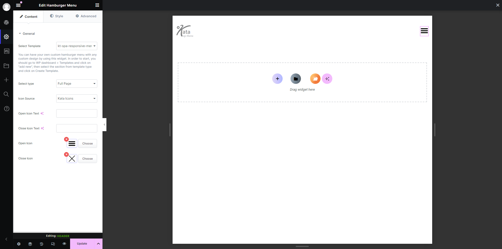
Go to the Kata Hamburger Menu settings and choose the template you saved in the previous step. This links the menu to the toggle button, so tapping it on mobile will display the advanced menu.
Manage Visibility Settings for Different Devices
Display Settings for Large Screens
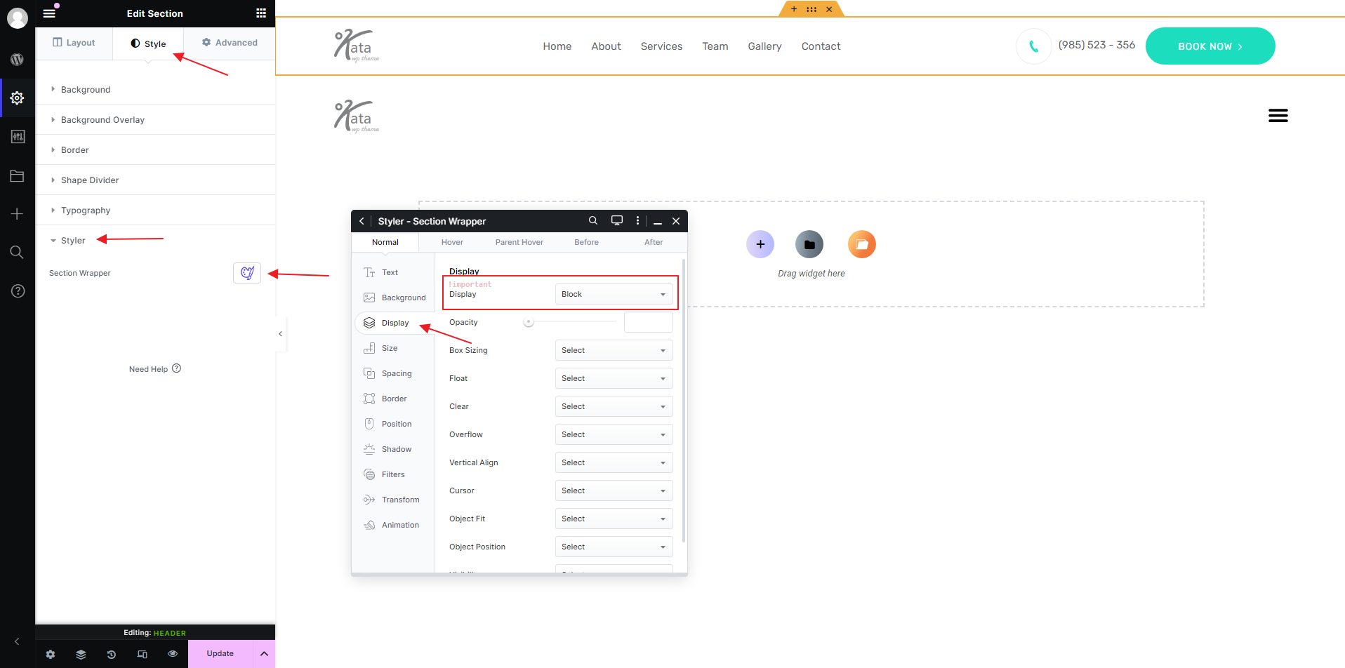
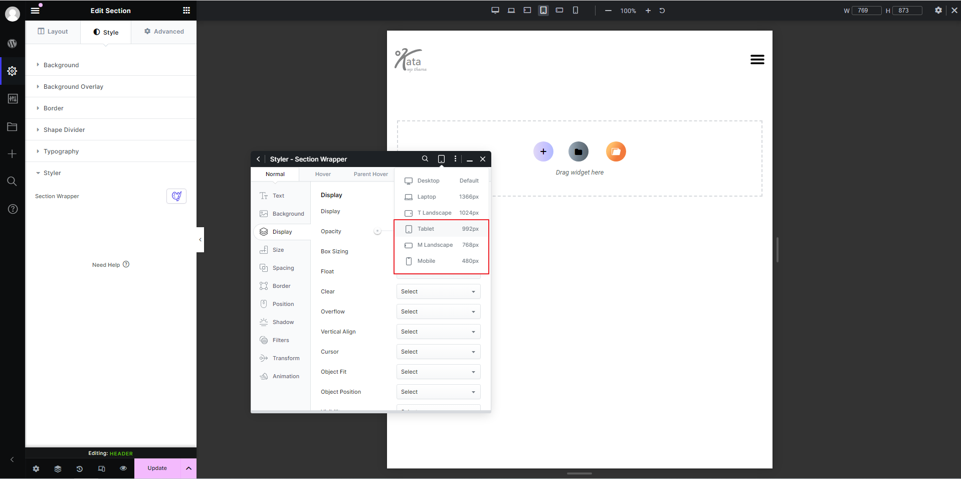
Set your main header section to Display: Block for larger screen sizes (Desktop, Laptop, and Tablet Landscape) and Display: None for mobile, small mobile, and smaller tablets.
Display Settings for Mobile Header
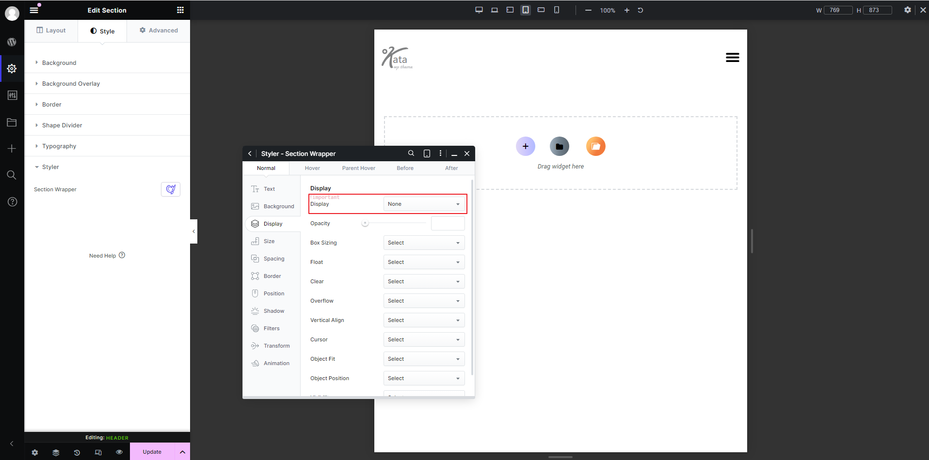
For the mobile-optimized header section, reverse these settings: Display: None for Desktop, Laptop, and Tablet Landscape, and Display: Block for mobile, small mobile, and smaller tablets.
Conclusion
With these steps, you’ve successfully implemented a responsive, mobile-friendly header using Kata’s advanced Hamburger Menu feature. By creating a toggle menu that opens to a full-screen layout, users can easily navigate your site on mobile devices, enjoying a seamless experience across all screen sizes.
