- Features
- Woo TemplatesModulesExtra FeaturesWoo Templates
You can customize every WooCommerce pages using Elementor page builder
Product FilterShopPress Builder offers this option and it allows your users to simply filter products by Category, Brand, Color, Rating, Tag, Size and Price, and find what they are looking for in a matter of seconds.
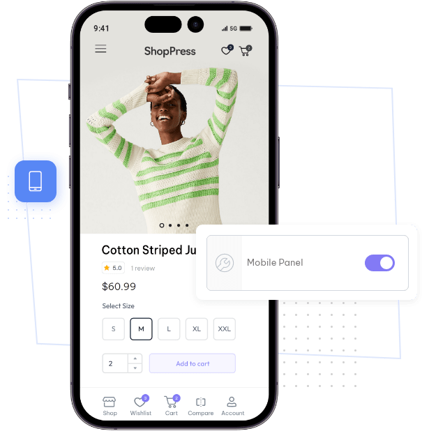
Off-Canvas PanelOff-Canvas panel widget is a fly-out content panel for showcasing contents like WooCommerce Filter, Wishlist, Cart etc. This panel can be in various formats like, Drop-Down, Popup and Slide-in.
- Demo
- Pricing
- Resources


