
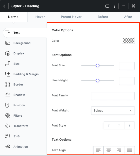
Styler is the most important tool in Kata that we use in ShopPress too, as it allows you to customize your website using a simple and straightforward user interface. You can change fonts, backgrounds, colors, and almost any other element present in Kata using the Styler. One could claim that even without any programming knowledge, all CSS codes are available to you via the Styler so you can change any element.
Styler Introduction
To access the Styler, you’ll need to edit your WooCommerce page in Elementor from ShopPress > WooCommerce Pages and add a widget to the page. Now, you see different elements in the Style tab and a styler icon in front of every option. Open the Styler by clicking on the icon for each respective option.
Styler Sections
The Styler consists of 4 sections:
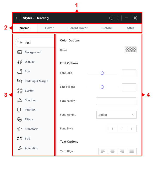
1- Styler Header
a) Name of the element and selector.
b) Collapse Menu button.
c) Devices button.
d) More button.
e) Save and Close button
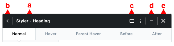
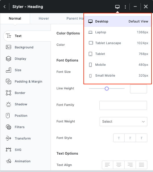
The responsive menu shows the different sizes for other devices in responsive design.
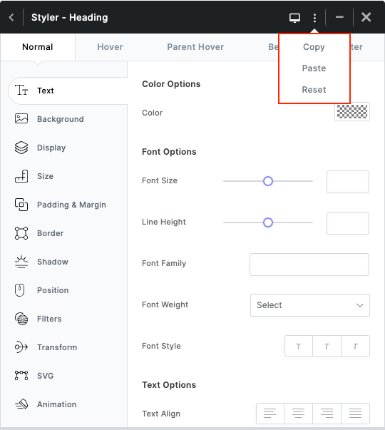
In the More menu, you can find the copy, paste, and reset options for the styles in the Styler.
2- Selector tabs:
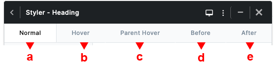
a) Normal: Applies styles directly to the selector.
b) Hover: The styles entered here will appear in a hover state.
c) Parent Hover: Styles entered here will have their wrapper loaded when hovered.
d) Before: This allows you to style the selector before this element.
e) After: This allows you to style the selector after this element.
3- CSS Properties
Similar properties are categorized on the left side of the Styler for ease of access. You can view the properties for each option on the right side.
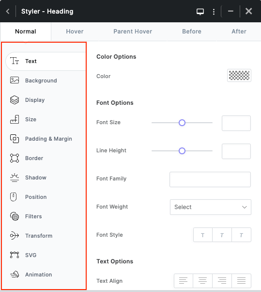
4- CSS Values
Here, you can see a list of CSS properties whose values you can easily change.
All changes will be applied to the elements in real-time.