
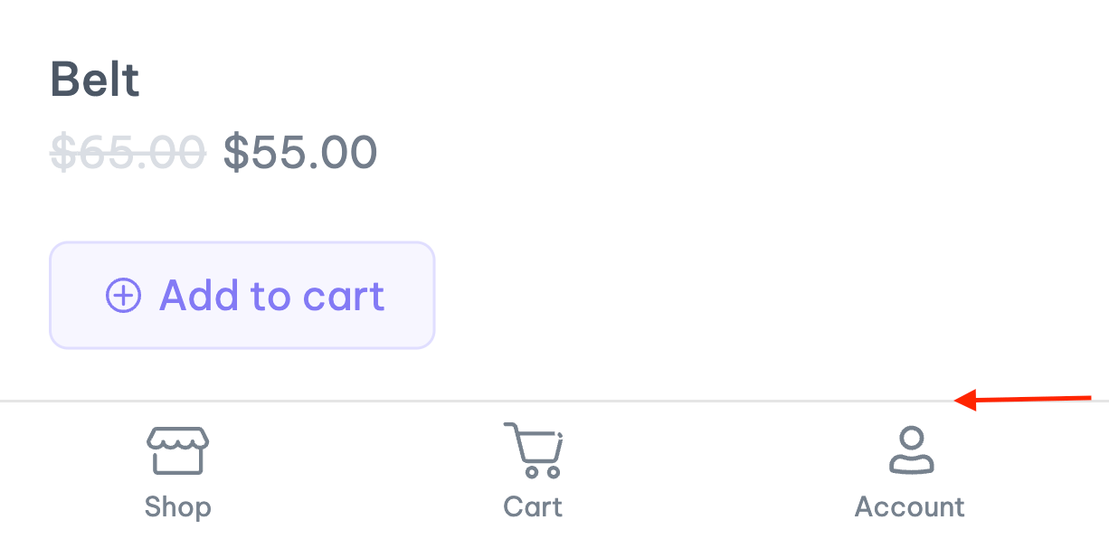
This tutorial documents how to use the WooCommerce Mobile Panel module. The ShopPress Mobile Panel module allows you to display an attractive and easily accessible visual bar at the bottom of web pages on any device with a screen size of 768 pixels or less.
Activating WooCommerce Mobile Panel
To activate the Mobile Panel, please follow these steps. First, go to the WordPress dashboard and ShopPress > Modules. After that, find the Mobile Panel module from the list of modules and activate it.
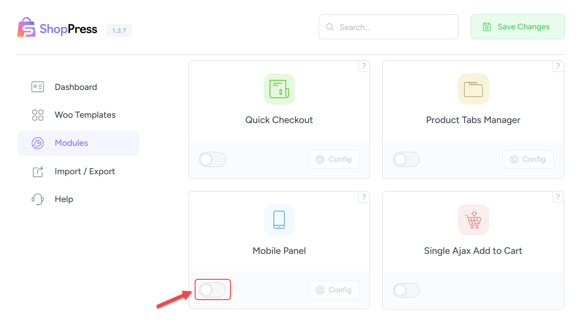
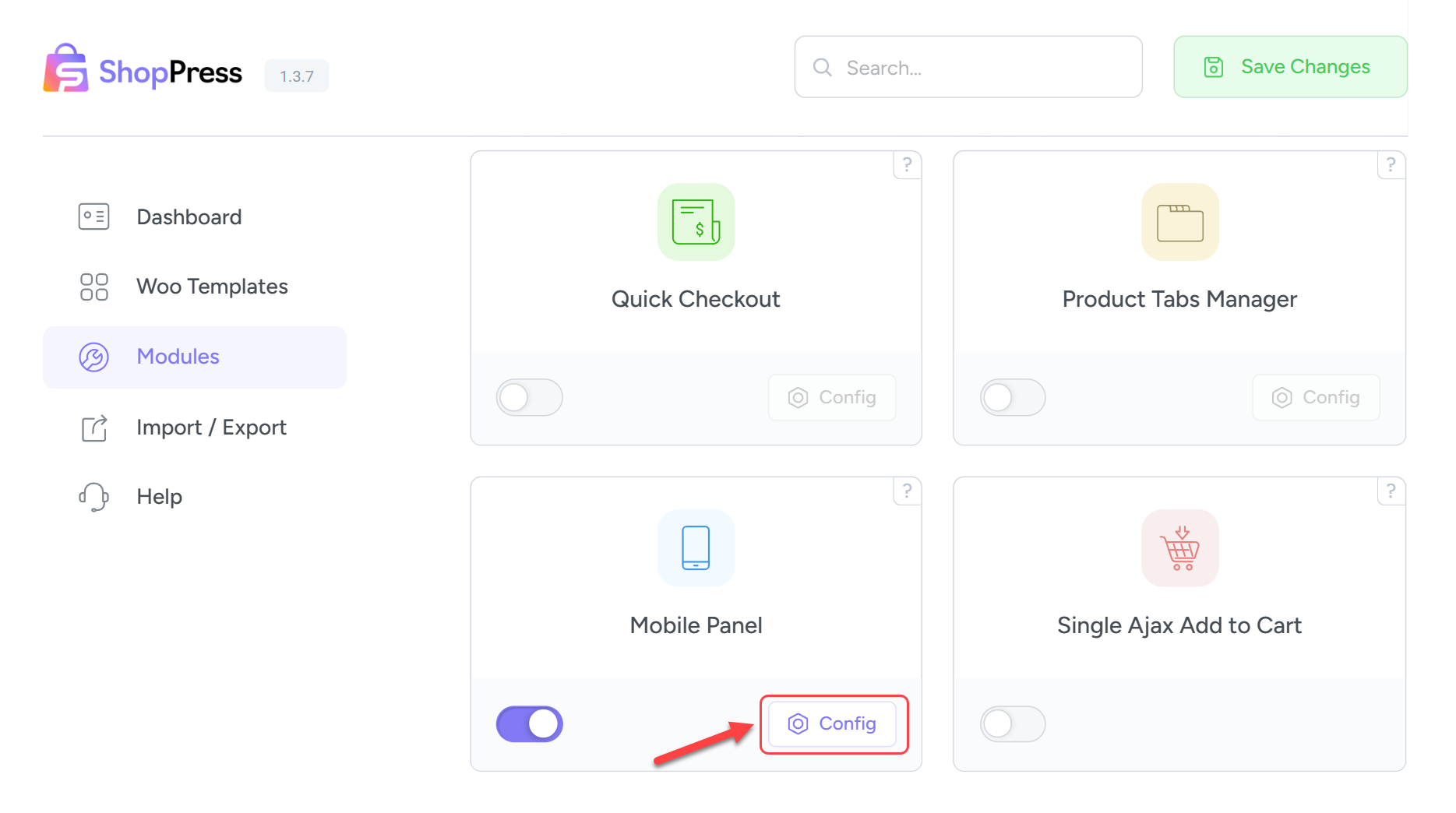
Next, you will see the Config button, which is now active. You can click on it to enter the module settings.
WooCommerce Mobile Panel Settings
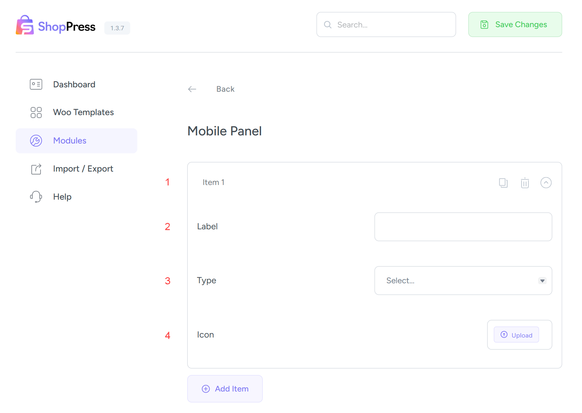
1- Title of each item.
2- Label of each item.
3- Type of each item. For example: User account, Product comparison, Shopping cart, and… You can also add custom pages.
4- Icon for each item. In this section, you can upload a desired icon to replace the default one.
Finally, I’ll share with you an overview of what you can create with the help of the Woocommerce Mobile Panel module.